I designed Additional services for mobile first booking. An interactive prototype shows how the page is split to screens in mobile UI.
Testimonials

Matias Pietilä
Great stuff! Works in mobile. Teemu’s work has a good, proactive twist. This project shows that off once again.
You can test the prototype with following situation of use.
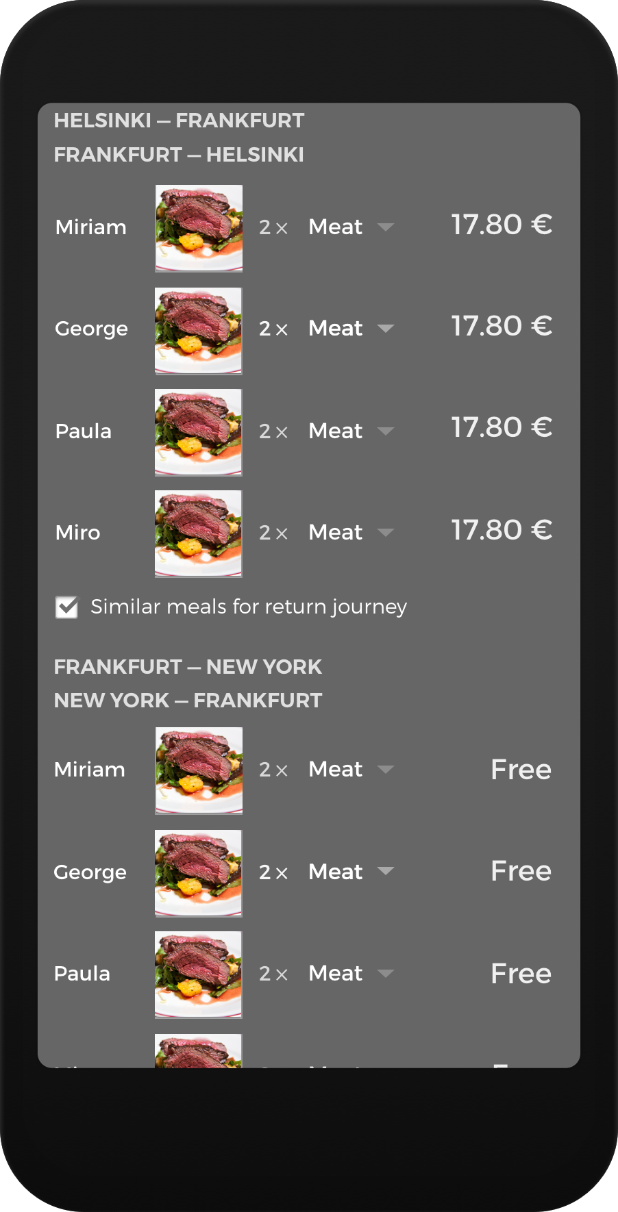
Flight services for a family
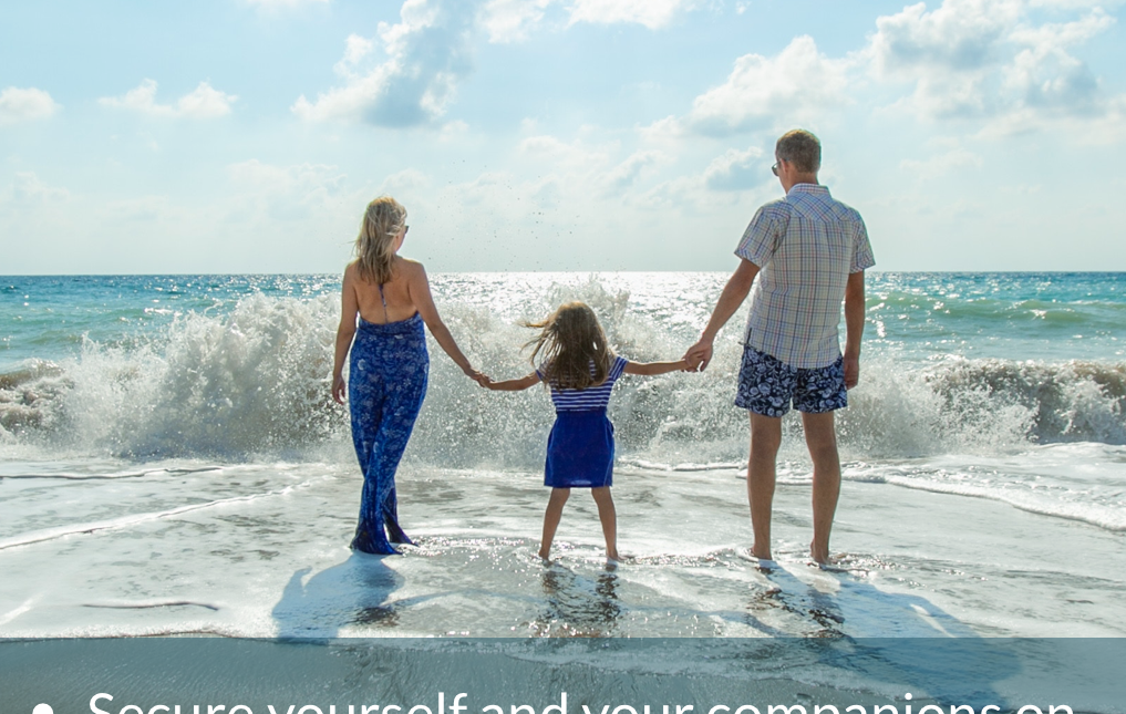
Miriam Nordman (38) is buying flight tickets for a two weeks family vacation in New York. So far she has input personal details on a flight company web site.
Miriam will travel from Helsinki to New York later with her family. She travels with her six years old son Miro (6), husband George (39) and husband’s mother Paula (68).
Moreover, two members of her family have a special diet. Paula does not eat red meat, and George has gluten free diet due to health issues.
Page content
Main challenge was to turn two A4’s plain text into great mobile UX and UI. The prototype above has same content as assignment below.


Assignment

Wireframes
Insurances illustration communicates that you are secured not only on plane, but also while in destination. Text layered on top of the image communicates other benefits.

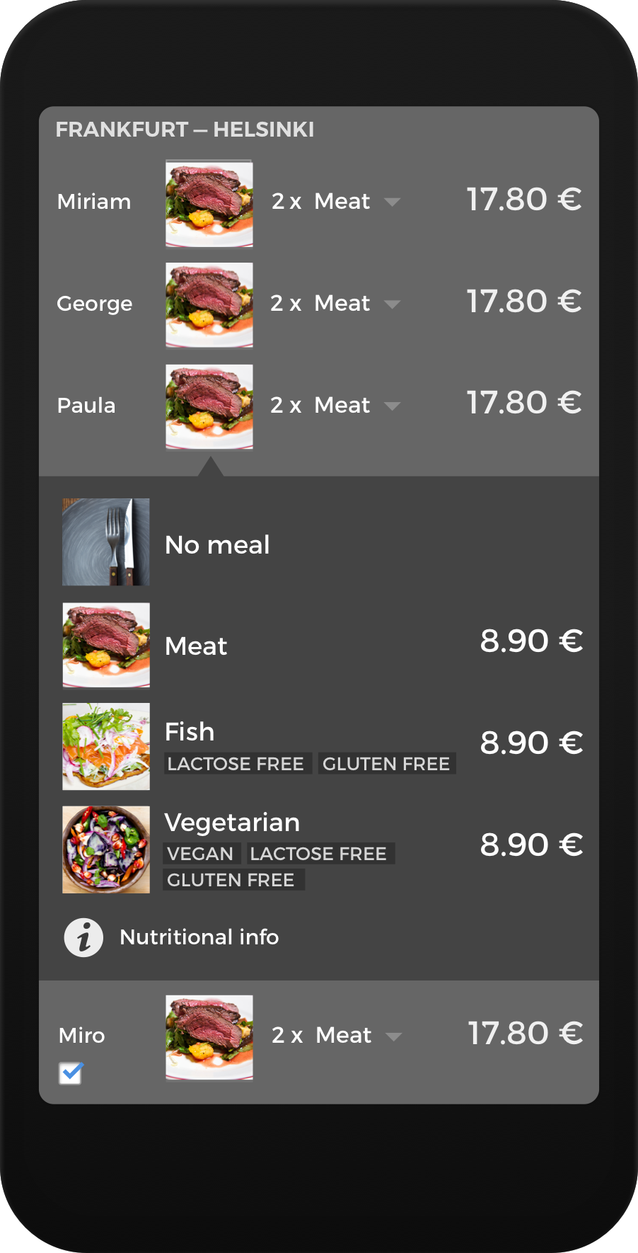
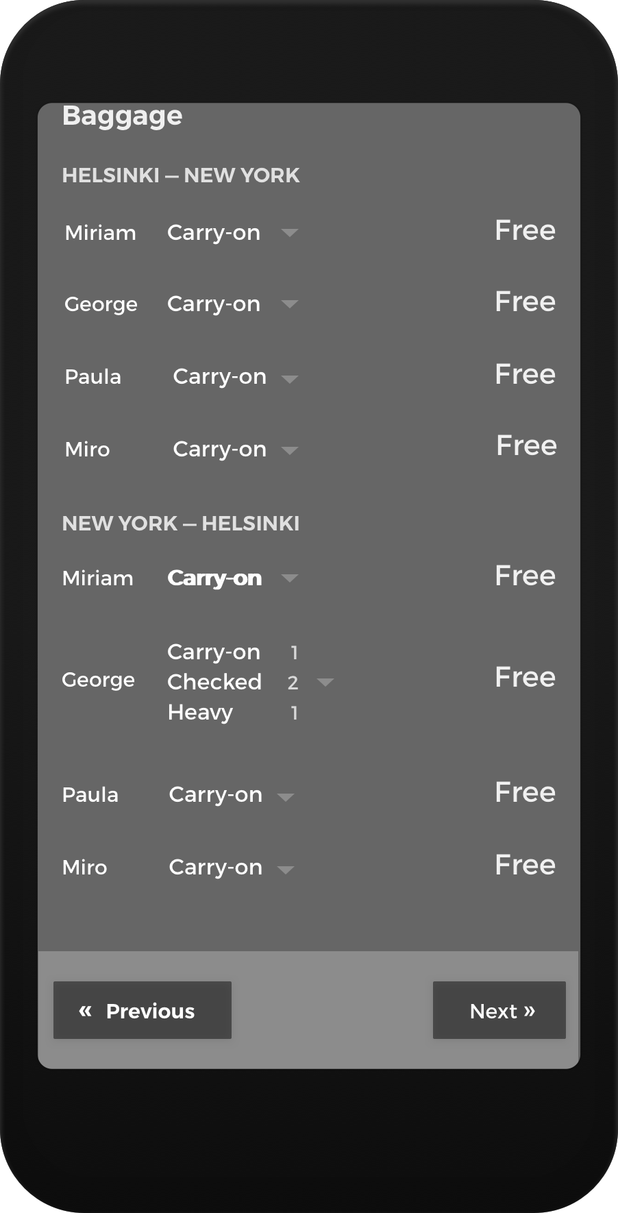
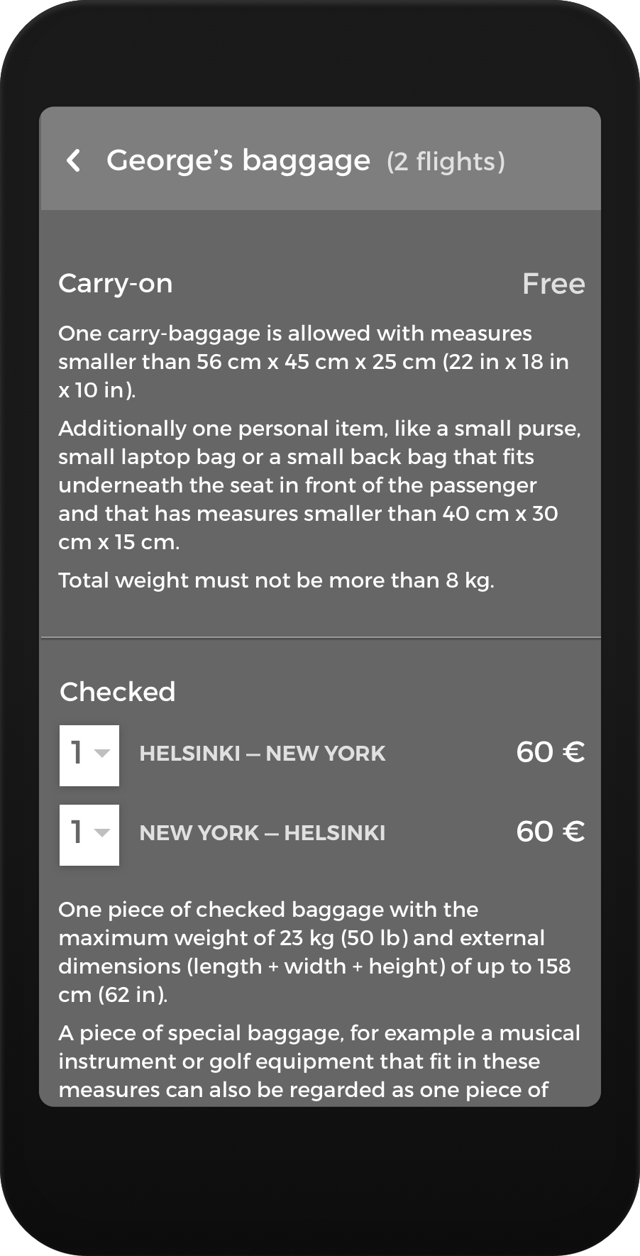
Expansion panel provides an alternative UI for meals. Showing things directly in in context would add to usability.
Yet another screen would still be needed because an expansion panel does not have room for nutritional info. An expansion panel has also less consistency because it does not fit all luggage information.
Customer feedback
The interactive prototype above is a third version. First version was reviewed in a customer meeting, and improved based on customer feedback. Related screenshots and meeting minutes are below. The screenshots are from first version.

Meals
- Provide a meal package. Illustrate it like insurances.
- Customer preferred a less aggressive sales approach. Thus have no meals selected initially.
- Make meals section the first section of main page. Put another way, place it before insurances.
Footer
- IOS Safari reserves 40 pixels at bottom of page for system level interactions. Thus footer buttons of first version cannot be clicked on iOS devices.
- Have a button height margin under footer buttons.
- Moreover, show total price at end of page, too.
Form controls
- (1) Use icon buttons instead of dropdown menu because dropdowns have only three options each.
- (2) Both customers misunderstood that toggle buttons are disabled. Thus use a saturated color for active state, even in grayscale prototypes.
Information architecture
- Experiment with selecting product first (as row) and people second (as columns).
- Try this for both meals and baggage.
- This improvement is not implemented yet.
Visual identity
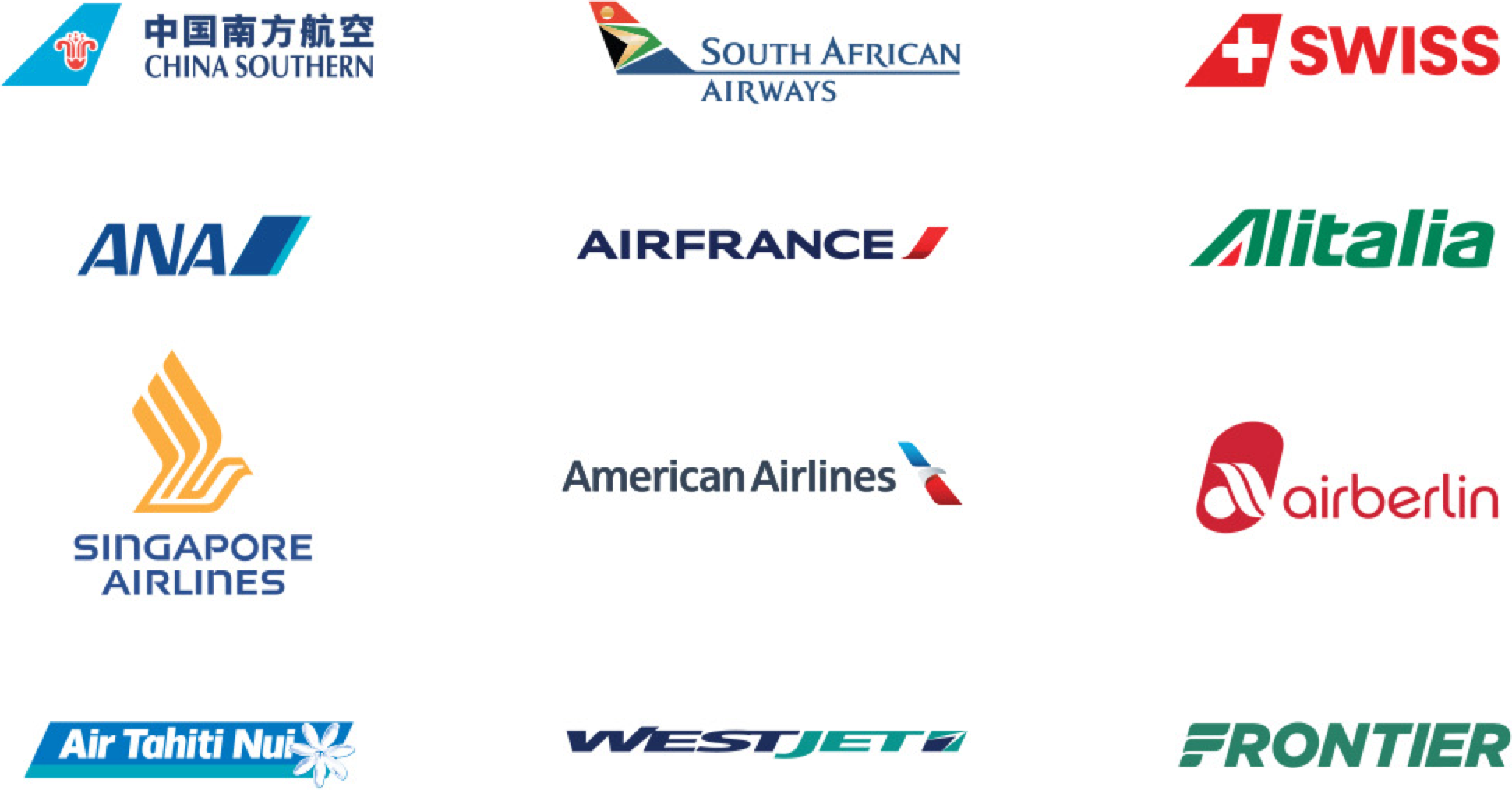
Most flight companies have dark blue and red as brand colors. Thus I use red and blue in the prototype.
Flight company logos often contain diagonal shapes. Hence selected tab resembles a wing, and the diagonals.

Miriam would buy travel insurances to secure her family abroad. Newest llustration targets this need.

Credits
I designed all interactions and visuals for wireframes and the mockup. Yet a great assignment contributed to good results. Thanks, Matias Pietilä and others at Qvik. I enjoyed doing mobile first UI design for complex data.
Moreover, I have got great questions, when I have demonstrated this case. Special thanks for sharing confusion about luggage overview to several people. Selection screen gave poor feedback because overview had flights, but selection people first. Your feedback helped me to learn from the mistake, and to put people always first.