I designed new features that help people to reach materials across libraries and archives. I also helped to implement them.

Background
Ministry of Education and Culture funds Finna project. They wanted to have a one-stop site for archive, library and museum materials.
Finna runs on VuFind platform. It is an open source library catalogue. Villanova University created first version of VuFind (image below).
In short, a single organisation created VuFind for their own materials. Yet Finna.fi contains materials of many archives, libraries and museums. Such an initial setting caused friction, and turned out essential.
Recommendations

Heli Kautonen
Teemu worked in my team at the National Library of Finland for nearly 4 years. During these years, I learned to know his strengths as a talented user interface designer and a passionate advocate of the user. I know Teemu as an independent and experienced UX professional, and will speak for him to anyone who needs a dedicated UX designer in her/his team.

Timo Laine
We worked together on the Finna.fi project. In these years, two things in Teemu’s way of working have left me with a particularly strong impression. The first is his dedication to understanding the needs of the user, and how to serve them best. The second is his interest in teamwork and in understanding and continuously improving the patterns and practices of the team, especially in agile contexts.

Matti Sarmela
I appreciate Teemu’s professionalism and customer-oriented and personal way of co-operating in b-to-b relations.

Tapani Sainio
I got to know Teemu at the National Library of Finland. It was a joy to collaborate with Teemu. I enjoyed especially doing the concept design of Finna.fi together. I think the service would not be what it is now without his insight and effort.
Context of use
I simulated the use of Finna.fi with tens of example situations first, when I started Finna work. The situations were about studying, researching, teaching, journalism, history, arts and literature enthusiasm.
Finna.fi customer journey

![]()
![]()
80% of users come to Finna.fi from Google, and most of them land straight on content pages. Yet less than 15% of Finna material is available online. Thus you often need to go to a library, archive or museum, when you want to actually use a piece of material.
Physical materials
For example, let’s consider a student who needs to find an exam book in last moment. All book copies of his/her university are taken because s/he is late. Yet nearby universities have many copies available.
Moreover, researchers use mostly nearby archive materials. See our contextual study. Yet this article focuses on the library use case above.
Initial usability
Finna.fi search worked well in the initial usability walk throughs. Yet its interface did not show, whether and how it is possible to use materials. That blocked usage in many situations.
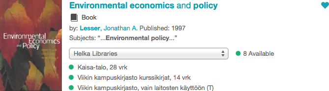
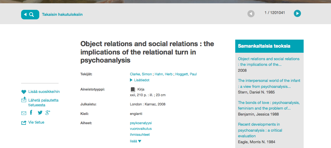
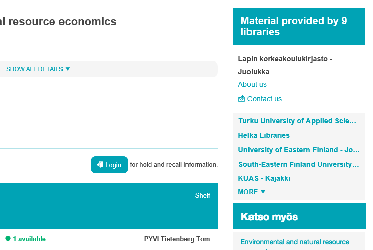
Finna.fi interface had one cross-organizational access feature, when I joined in. Search result list snippets showed all organizations and service points that have copies (image below).
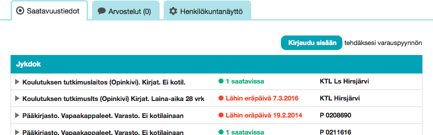
Finna.fi also showed copies of a single library. The availability table (image) is in material details page.
Existing features were good. Yet for several reasons, Finna.fi users needed more.
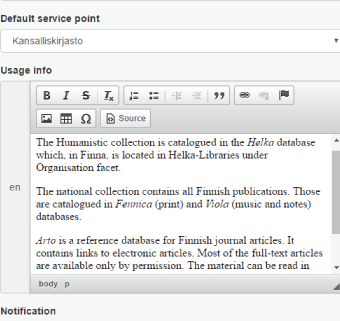
Material page UI access information
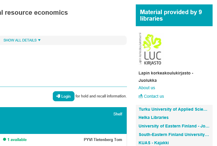
We started by completing what we had already. Material pages did not contain any cross-organizational information, when I joined in. Yet our search result list showed already the content.
Before
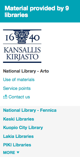
Most users come to Finna.fi from Google, and land on material pages. Thus the page must tell, which organizations have a piece of material. Hence we added a Material provided by element. See right column below.
After
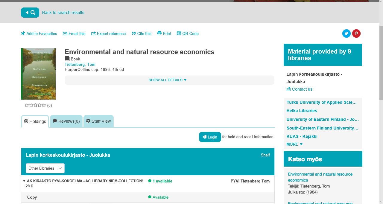
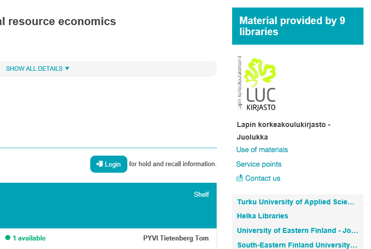
Most Finna.fi users need a few details of a piece of work. In contrast, center column had a lengthy data table initially.
For example, when a student looks for an exam book, s/he needs to first check that book name, author and publication year match. Then s/he will have access related questions. Are copies of the book available? Are the available copies easy to access?
An availability list was always there. Yet it was often not visible on phone, tablet and laptop screen sizes first, when the page had been loaded. The old layout worked well only on big table monitors.
We added “show all details” progressive disclosure to the data list. Hence availability list is now more dominant in the page layout.
Focus changes
Finna.fi focus moved from searching to accessing material, when I became responsible for it. We created a Finna.fi concept proposal together with service planner Tapani Sainio and UX / Frontend Designer Aleksi Turpeinen. Finna.fi customer board approved the proposal.
Later on Tapani left Finna, and service design became difficult. My focus moved then more to UI design. Aleksi started to do frontend because we lacked developers, too.
I designed three location features that help to access Finna.fi materials. Anna Helminen and Tuomas Nurminen from User Intelligence evaluated the features in a 2015 usability test. I was buyer in the study.
Following chapters introduce the three location features.
Organization introduction pages
Many Finna.fi users do not know that everybody can use the services of Finnish university libraries, and what services archives and museums provide. Organizations can now tell about access on their introduction pages (images below).
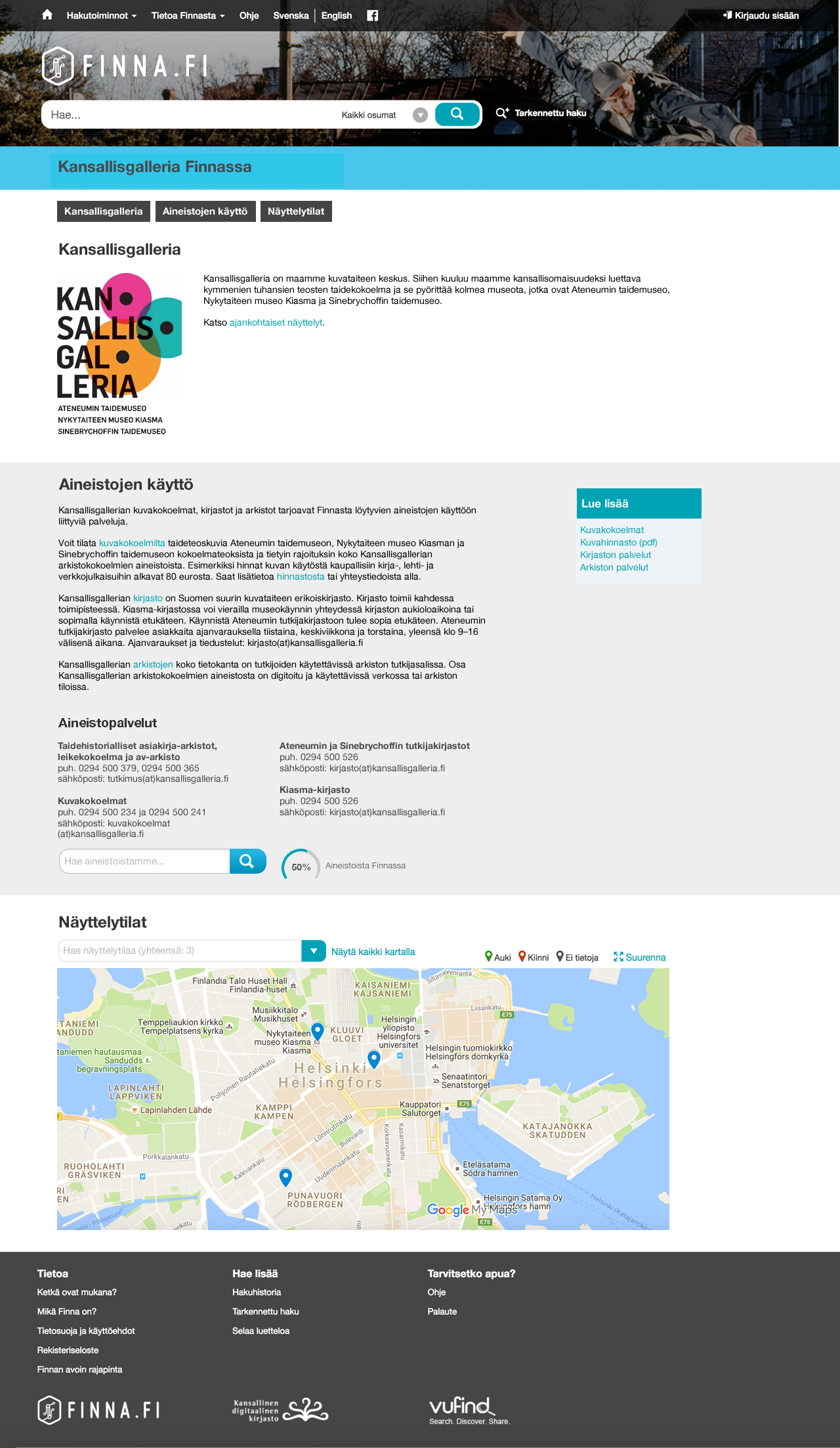
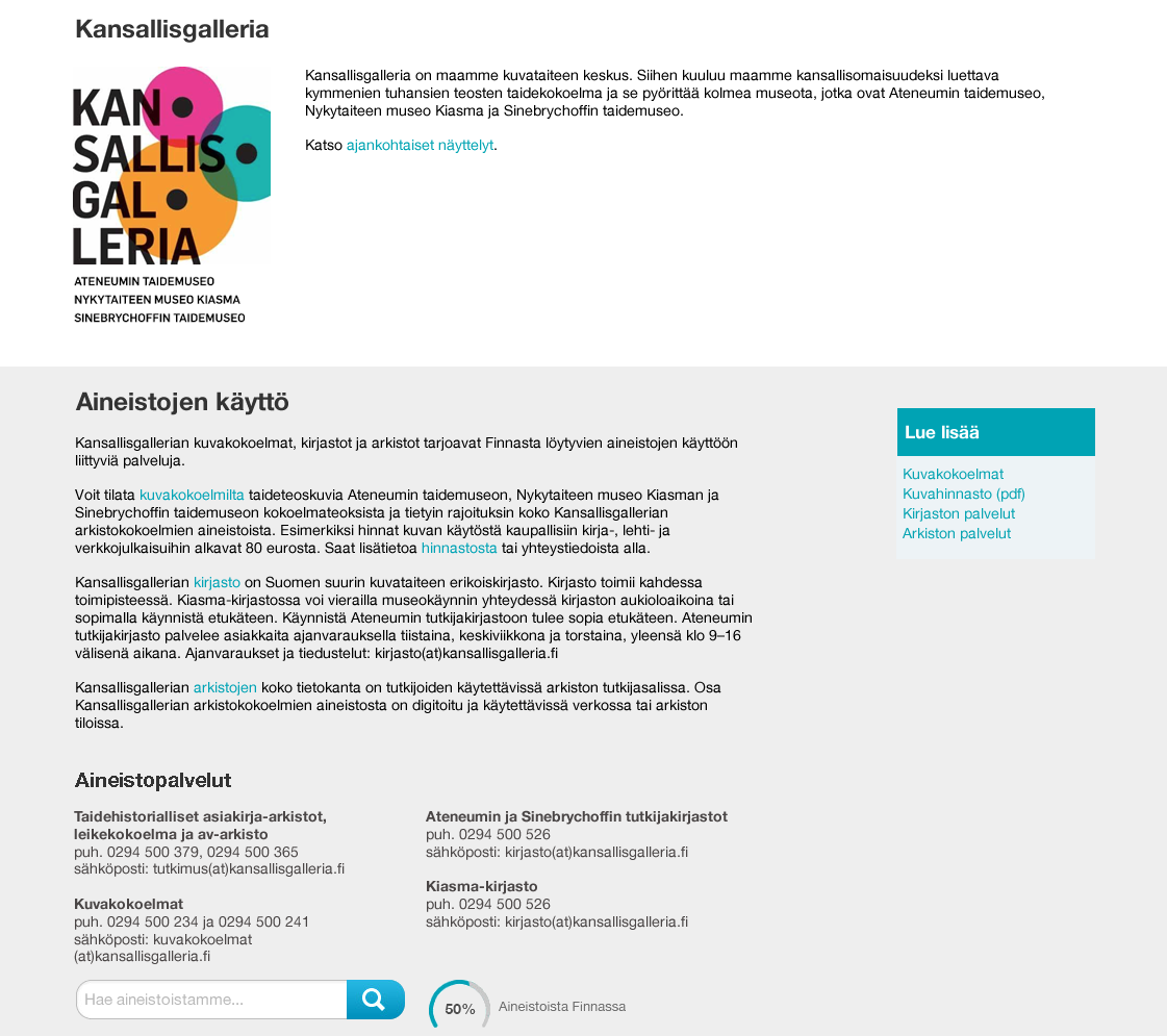
Finna partner organizations wanted to introduce themselves. We also needed least software components for this feature. Thus this was a good place to start, and our team programmed it first. Same components will do for following features, but need extension.
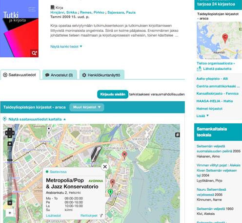
Library material availability map
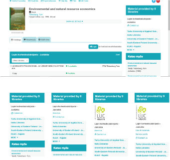
The library material availability map (mockup) was successful in 2015 usability tests.
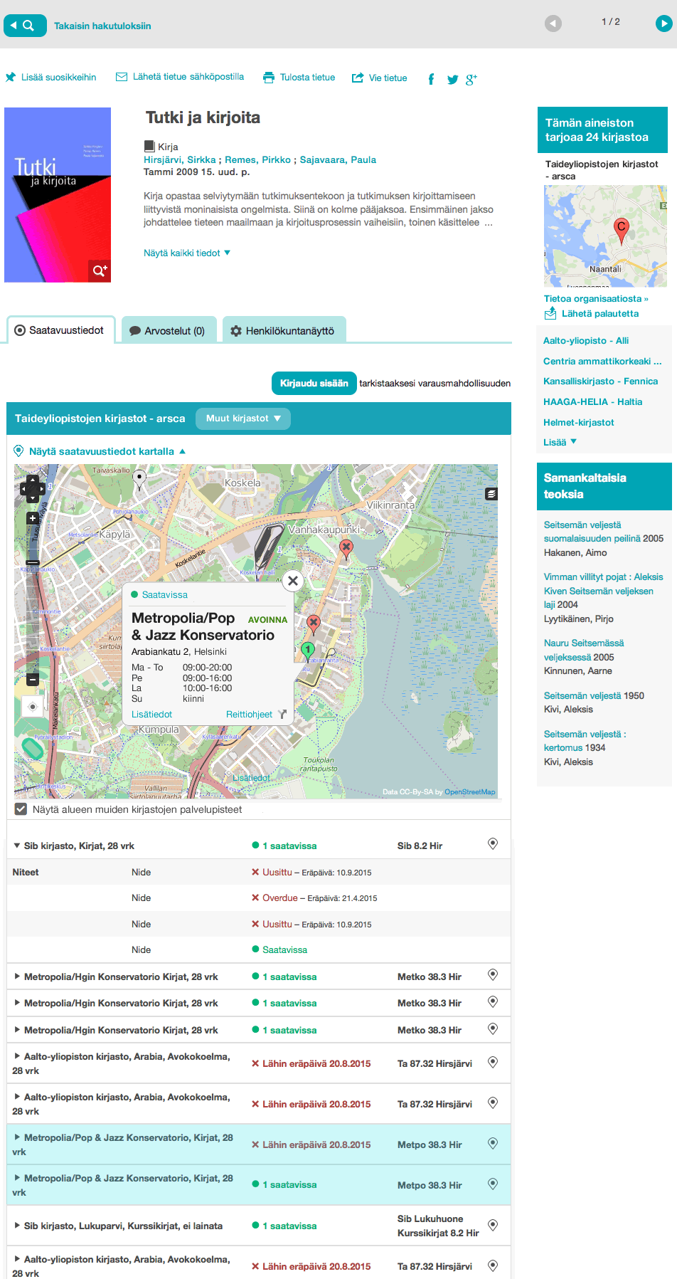
Most users proceeded fast to the library material page (image). Consequently, they found the availability map easily. First they had searched the book by name on front page, and then glimpsed a couple of snippets in search list.
Most people who come to Finna.fi from Google see this page first. Then availability map is easy to find.
The drawback of this feature is that it shows only the availability of an edition of a book or other work. For example, newer releases of the book Tutki ja kirjoita are not present in this image.
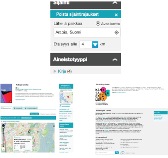
Location facet
The location facet (mockup) filters out material which is far from a given geographical point. This provides an efficient way to reach library books and other physical materials.
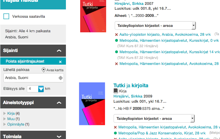
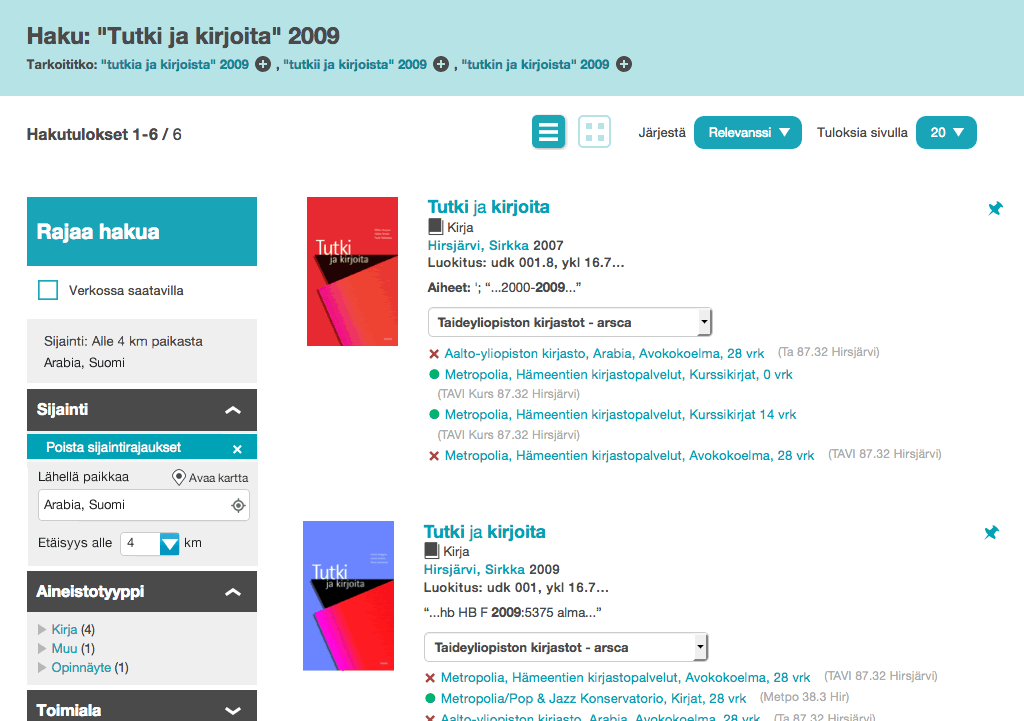
Both dropdowns in the image have 40+ items. In the future, even more libraries will join Finna. The location facet limits lists length to a couple of items.
Already 40% of Finnish university and polytechnic library search users use also the Finna.fi site. This means 100 000+ people. The location facet could benefit those people.
Unfortunately, most participants’ flow did not hit location facet in the 2015 tests. Who would expect that Finna has this feature, when nobody has implemented such a thing before!
However, the use of facets has multiplied since 2013, when users have become more familiar with Finna. I believe that users would learn to use the location facet, too. Yet it will be of little interest for first time users who come from Google.
Input of organisation data
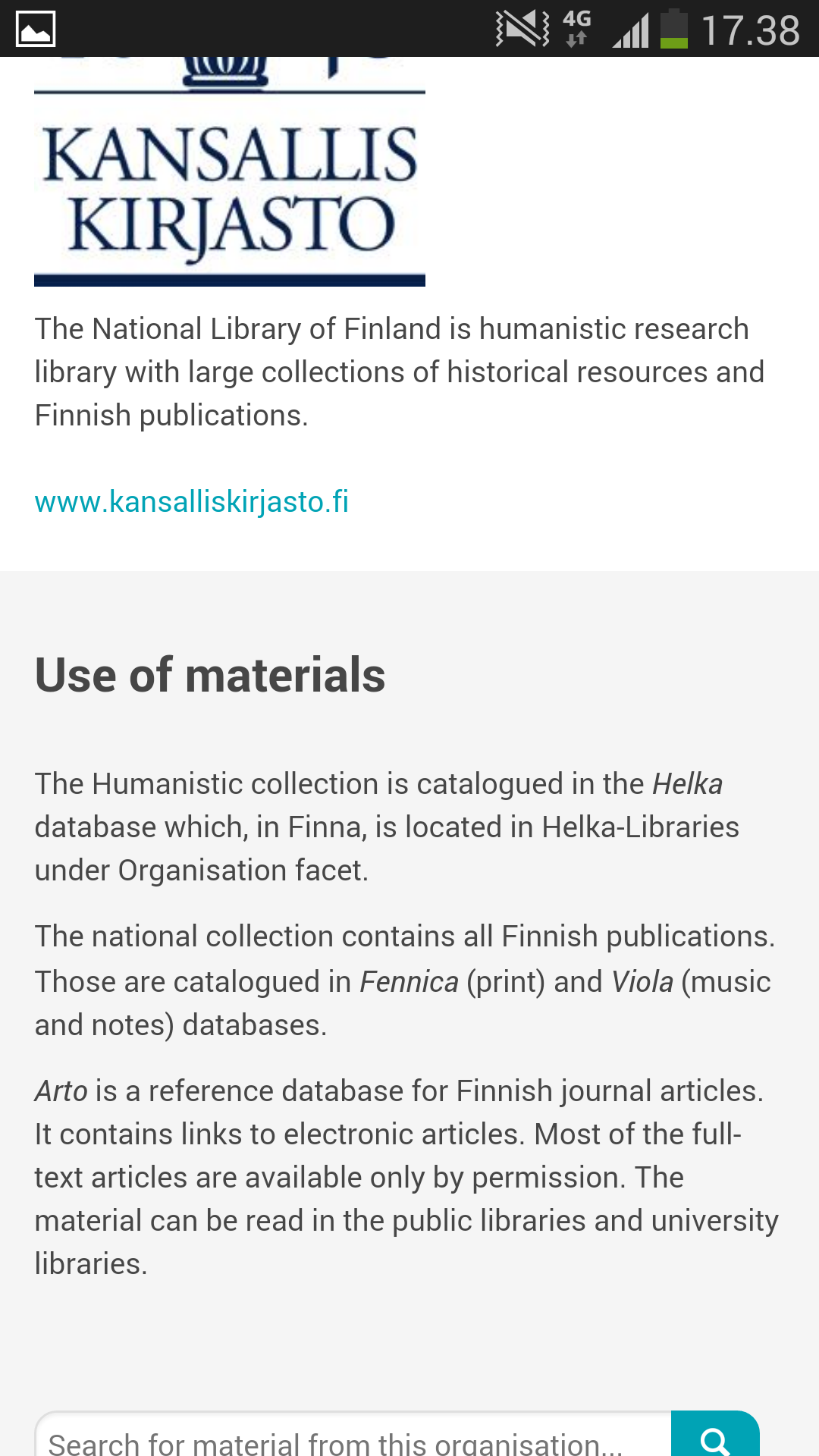
A service called Kirkanta works as data storage for Finna access features. Kirkanta is the backend user interface of Kirjastot.fi library directory and API services.
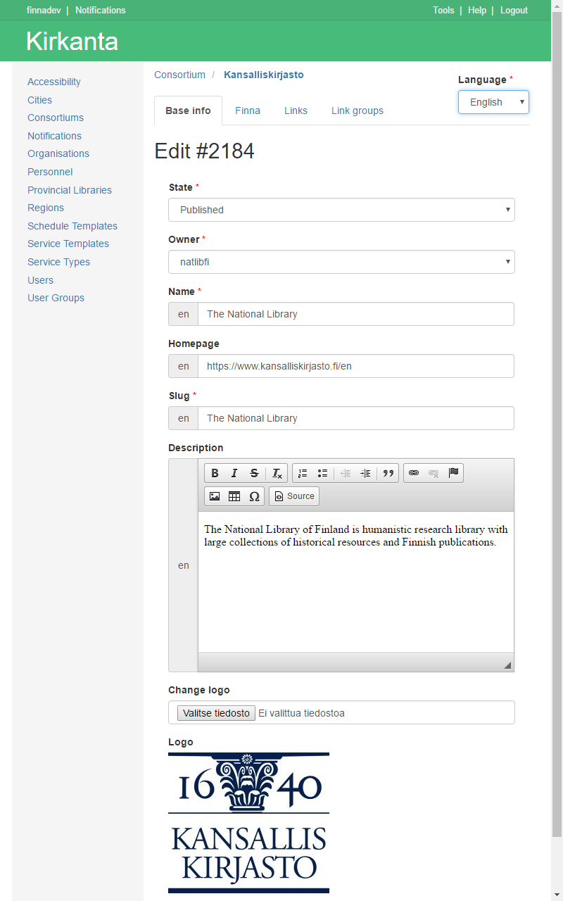
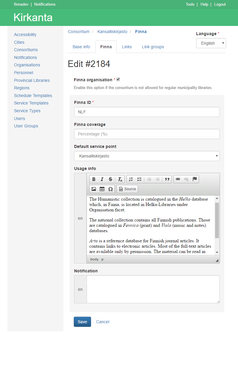
I contacted Kirjastot.fi editor in chief Matti Sarmela to ask, whether we could use their API. He even agreed that Finna could use Kirkanta also for Finna archive organisations. Such flexibility is amazing from a public domain actor!
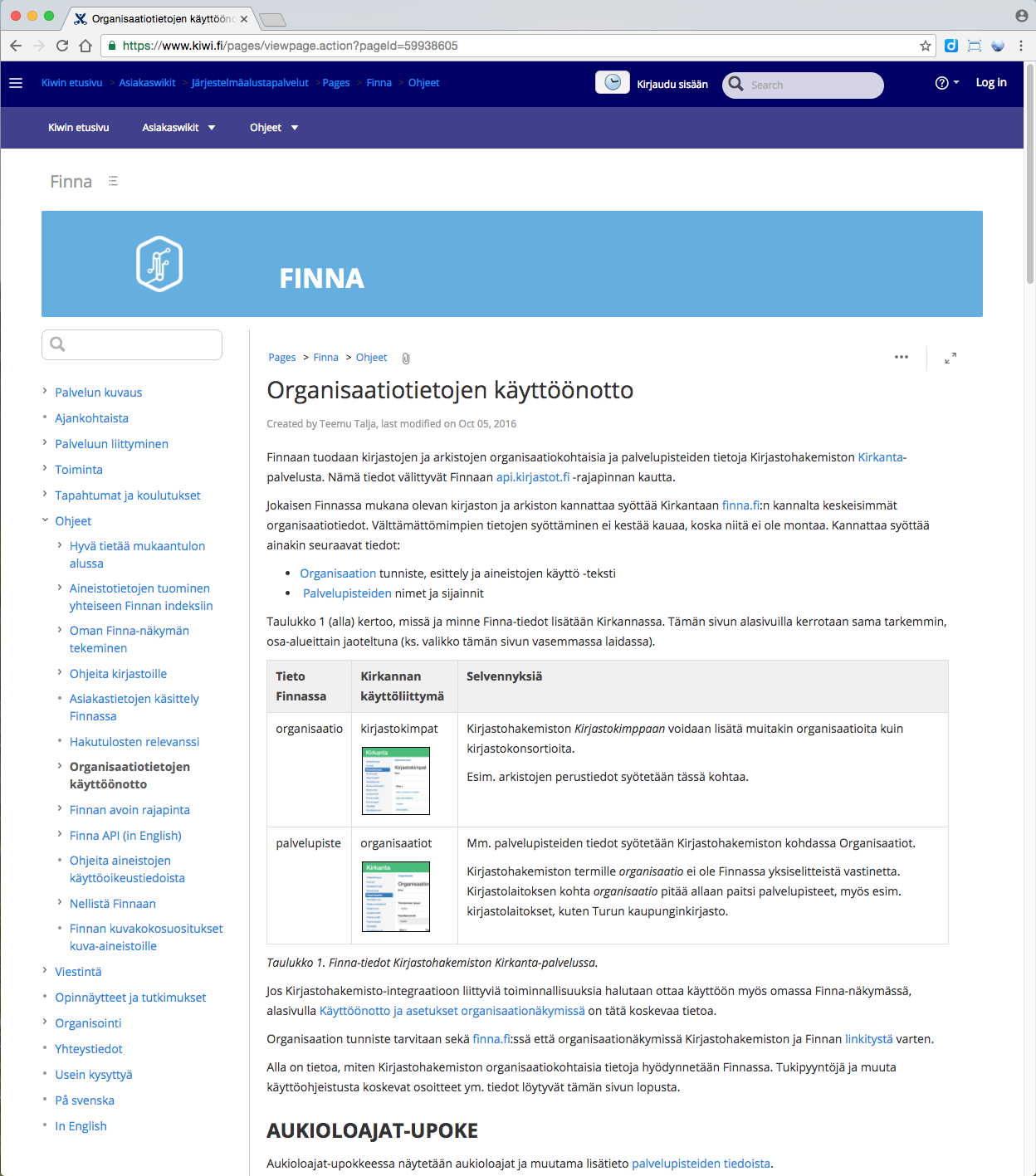
Our team lacked software developers. Thus I designed the information architecture of a new consortium section in Kirkanta (leftmost and middle screenshots). I also wrote wiki documentation of Kirkanta integration for library and archive people (rightmost image).
Links to introduction pages
The new material page UI and the organisation introduction pages were successful in the 2015 usability tests. However, test participants used an interactive mockup. Yet call to actions became poorly designed in first published version.
Analytics showed that hardly any users accessed organisation pages in the first version we released (leftmost screenshot). I thought that the links are too weak visually because right column links tend to be of secondary importance on many web sites. Therefore I returned logos to the links (middle screenshot).
Usage numbers did not improve much with the images. Thus I supposed that our link text is not appealing enough. Think of many company web sites, where About us page contains “boring company information”, number of employees et cetera. Seeing that, we put target page chapter titles to the link text (rightmost screenshot).
Interactive prototype
I prepared an interactive prototype for the 2015 usability tests. It is still online, so feel free to try your luck. Test task is below.
(English speakers: unfortunately it is only in Finnish.)
Testitehtävä
“Asut Helsingissä Arabianrannan kaupunginosassa, ja opiskelet Helsingin yliopistossa. Sinulla on koulusi kirjastoon Helka-kirjastokortti. Tarvitset opintoihisi kirjan Tutki ja Kirjoita tieteellisen kirjottamisen kurssia varten. Olet hakenut hakusanoilla ‘Tutki ja Kirjoita 2009’ Finnasta. Selvitä Finnan avulla, miten saat tämän teoksen käytännössä käsiisi, vai saatko?”
Re-evaluation (2018)
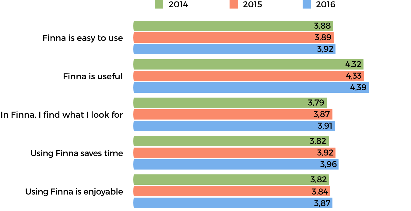
I followed a user-centered design process in this project. 4-star ratings in surveys of 10 000+ end users show that it was successful. See diagram below for a summary.
I am owing to everybody in my team and network for our success (credits). I enjoyed Finna work because colleagues appreciated UX design and research.
Lean startup
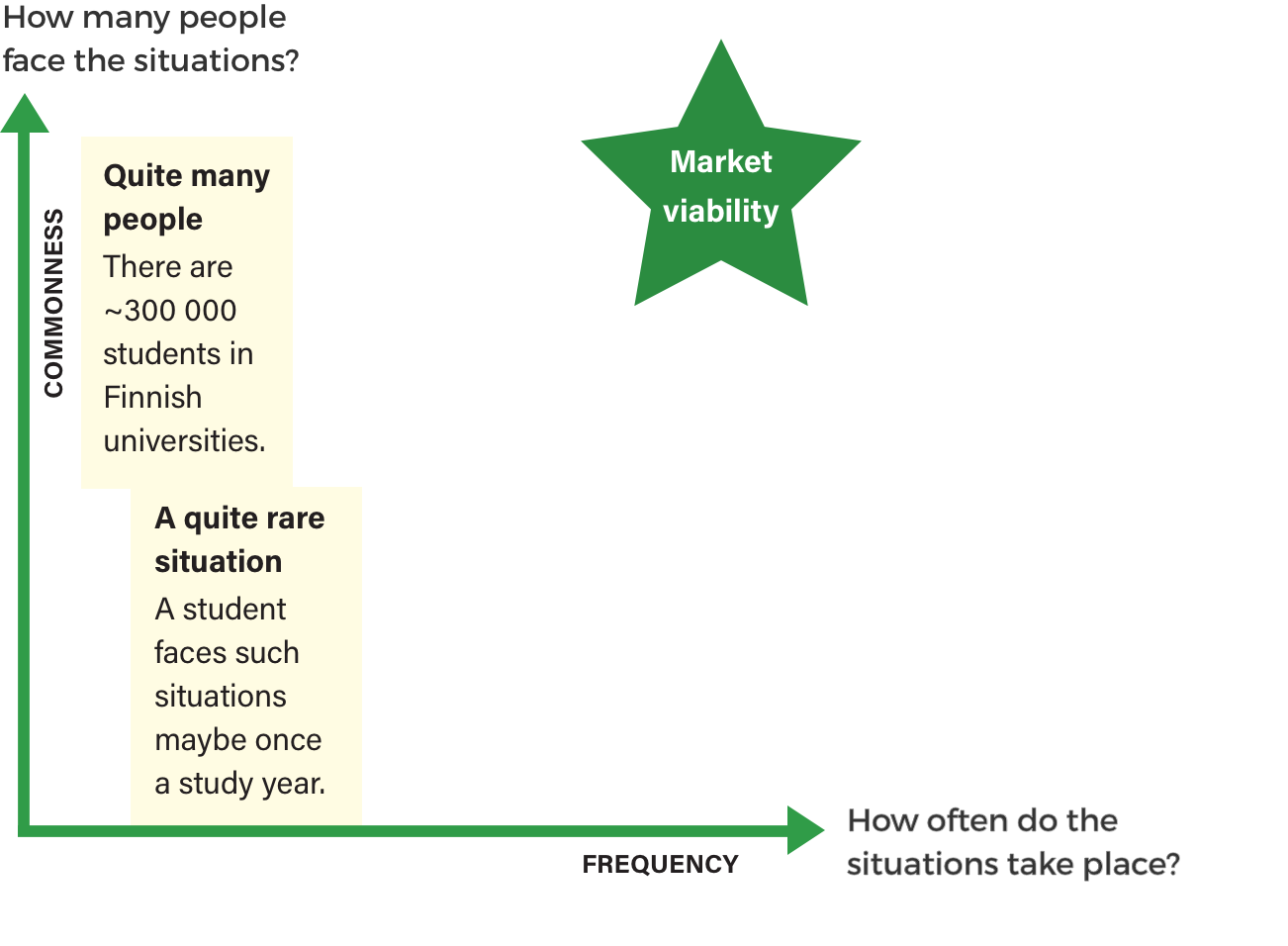
Yet I find my design workflow of that time lacking. Today I see personas and usage situations more from a marketing point of view, too. That a problem exists, is not a good enough reason to build a software solution.
To be market viable, a problem scenario should both repeat often and be common. An average student might face the scenario Last minute search for an exam book once a study year. In contrast, there are ~300 000 potential users. Yet such a “market” is somewhat instable (diagram below). Do students remember Finna.fi, when they would need it?
As a rule, you should measure also willingness to pay. That is not relevant here because Finna is free to use. In contrast, how many users would recommend to friends or colleagues, could be a meaningful metrics. Net Promoter Score measures willingness to recommend.
In our 2016 survey, the overall Net Promoter Score of Finna was 29,93%. That is a good result. Yet we did not measure it on feature level.
Lean UX
Looking back, our persona and scenario prioritization lacked co-design. Co-design became even more difficult, when Tapani Sainio left Finna in February 2014. I was then alone to lead Finna.fi customer board and Finna.fi development.
Leading the board alone was too much because both mediation and content were challenges. Thus I focused on UI design and development of earlier agreed Finna.fi features in 2015—2016.
Credits
Above all, I would like to thank my manager, Head of Services Heli Kautonen. She was an excellent coach, when I faced challenges. Thus my contributions above are also her contributions.
A frontend oriented UX designer, Aleksi Turpeinen, worked in same product team 2013–2016. His input was precious in countless situations, where I needed a helping hand. Aleksi was also design lead in many Finna subprojects himself. However, I was responsible for the cases above because I was Finna.fi concept owner in 2013–2015. Yet Aleksi did the visual design of the Show all details element of this layout. You can see my version of it here. Without Aleksi’s contributions to frontend many things would neither be live.
I am also owing to our developers Samuli Sillanpää, Ere Maijala, Bjarne Beckmann, Erik Henriksson, Jukka Lehmus and others. They most often ”scored our goals” by designing software and coding it. I feel grateful also for their UI design related feedback and suggestions. Moreover, peer support from Timo Laine was invaluable.
The designs presented above build on certain design assets. A design agency called Tsto had provided a visual identity previously. Moreover, initial versions of some core layouts had come from the VuFind open source platform. Last but not least, Anne Luotonen and Ville Hirvonen have done great work as designers in Finna, at different times.