
We created new ways for customers to discover games, improving both player experience and measurable business outcomes. I led a mobile-first redesign and validation of the designs.
User story


Could we bring bets from other betting products into Mikko’s customer journey?
From a business point of view, would that make sense?
Initial proto
Before
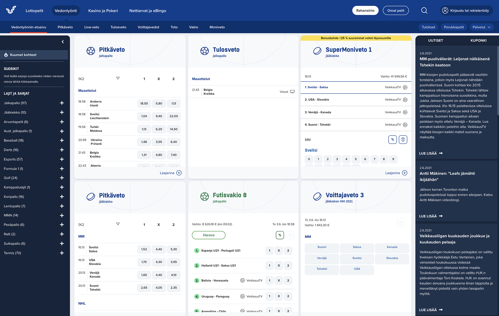
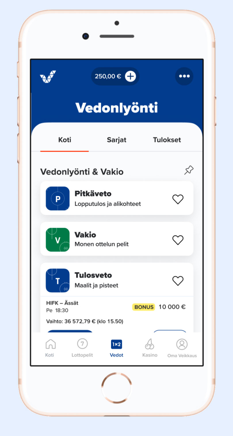
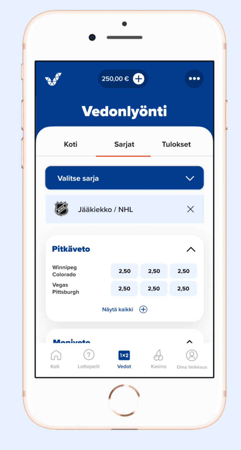
A major project had delivered suboptimal results when designing a shared view of six game products. The earlier design was desktop-first and had complicated data.
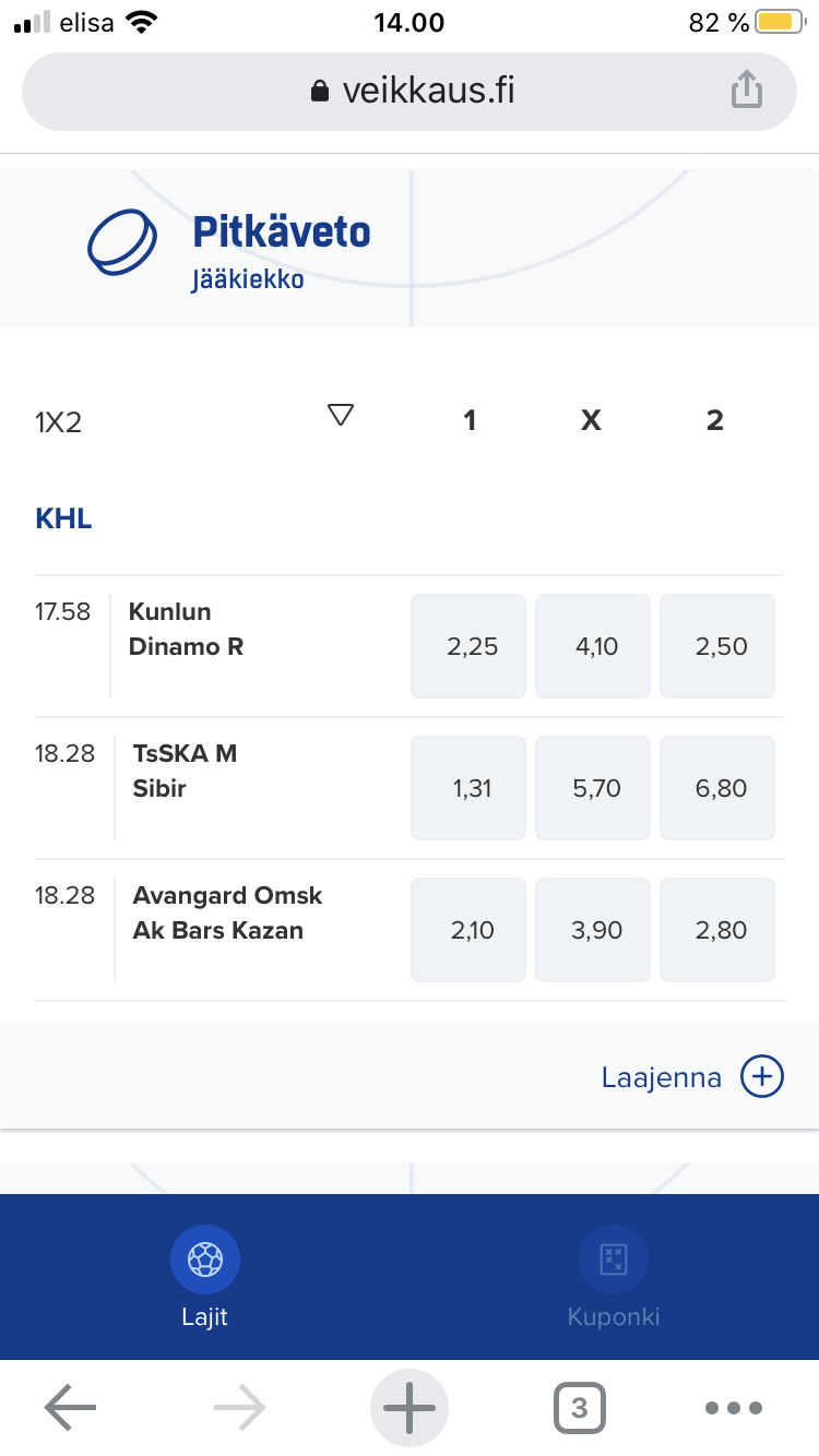
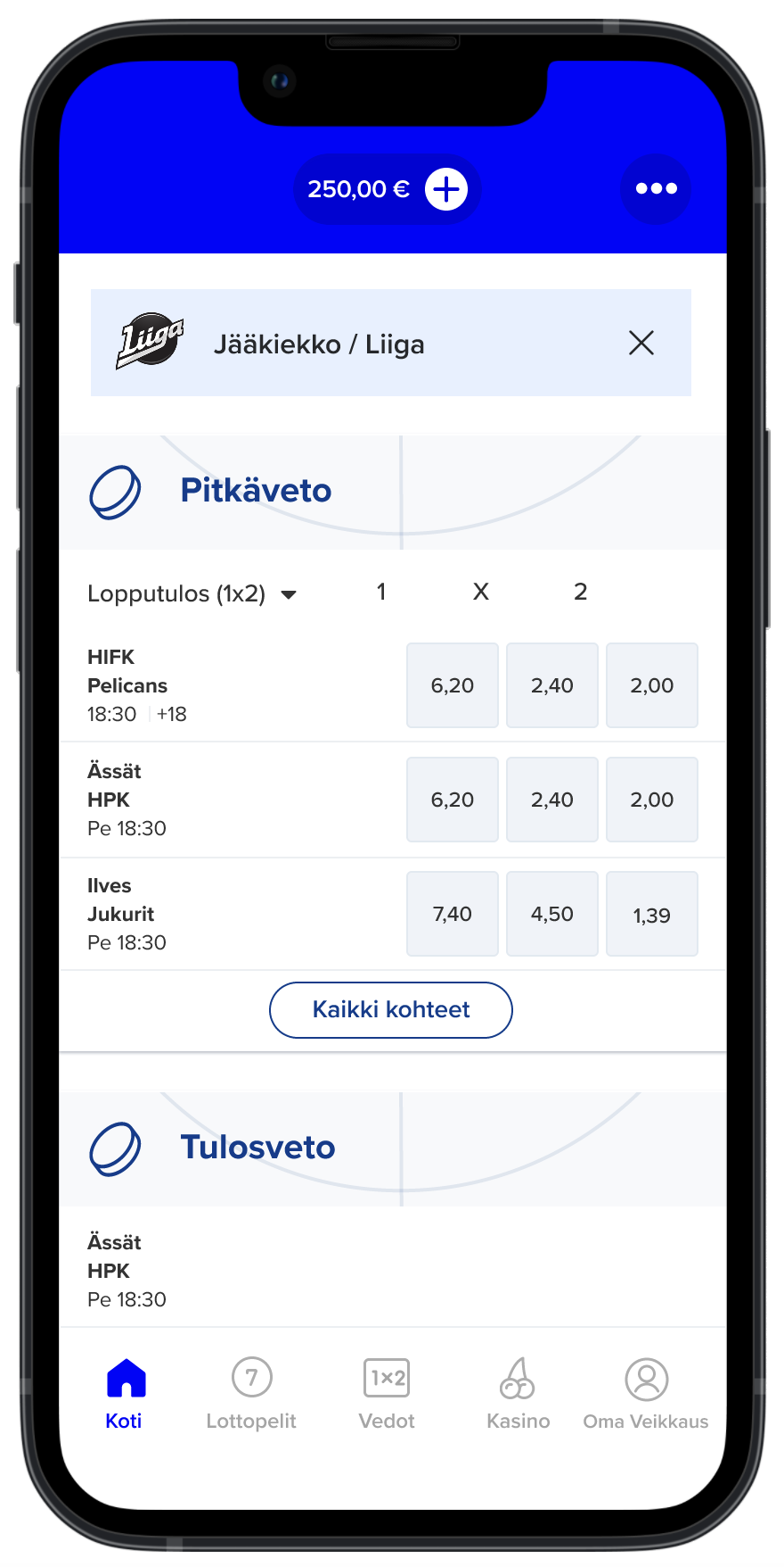
On mobile, the screen didn’t feel inviting. Would the layouts below encourage you to explore and scroll?
First ideas
Brainstorming
We ran an ideation workshop with 10+ designers, many experienced in betting. The workshop followed a “no criticism” rule to encourage open participation.
Above layouts show some workshop results. Great stuff!
The first layout, including league promos, is surprisingly close to our final Betting view. Still, we needed some detours because the brainstorming outputs lacked interaction designs and technical building blocks.
First prototype
We combined ideas into a user flow, and made a prototype of it. The proto built on my leagues view concept (second layout below).
Usability tests

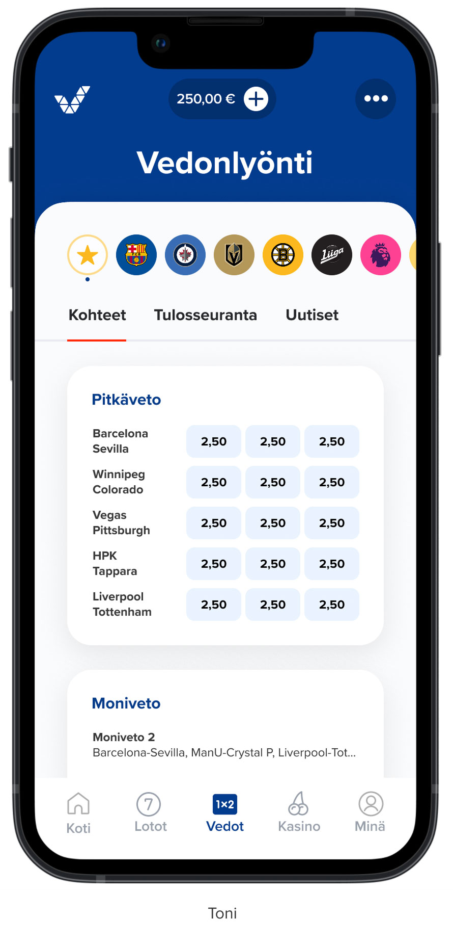
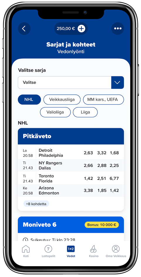
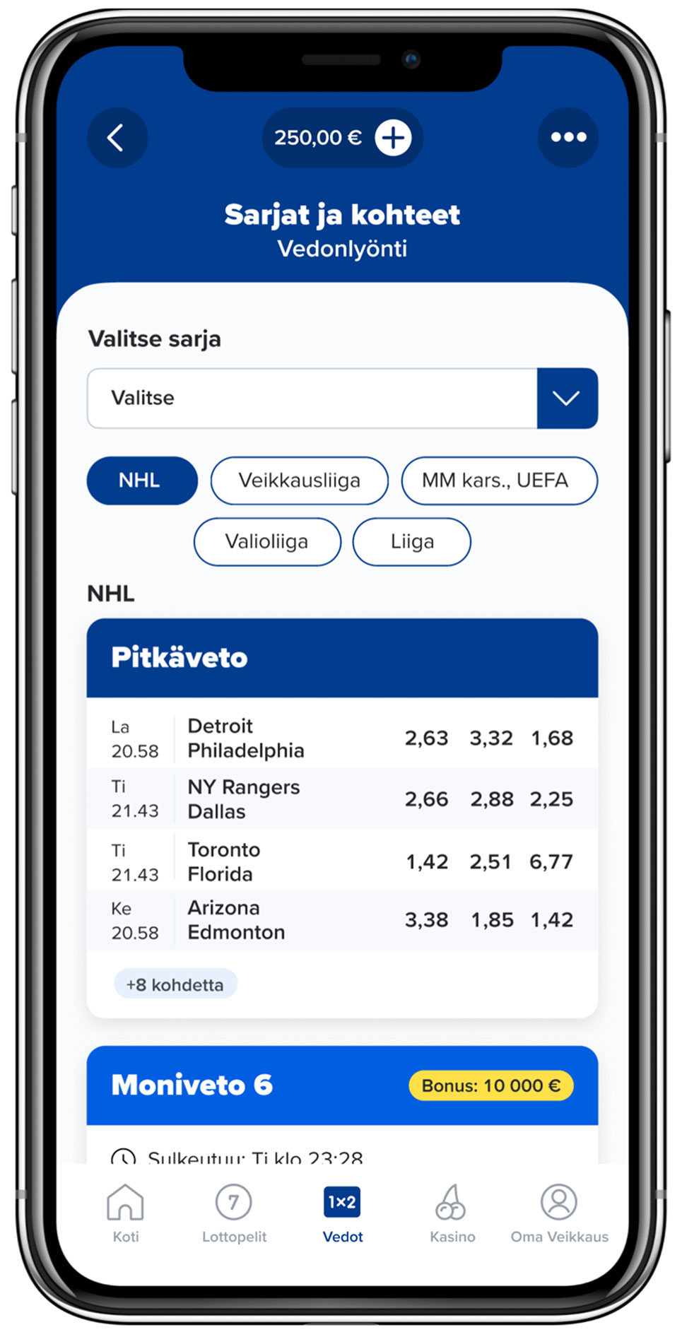
The leagues view fit our customers’ world well. Because customers chose betting targets by sport league, test participants liked the leagues view concept, and found it intuitive.
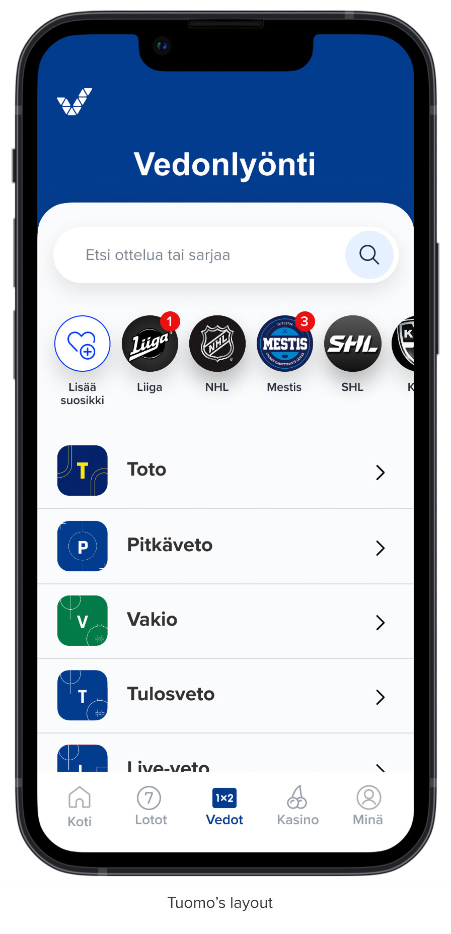
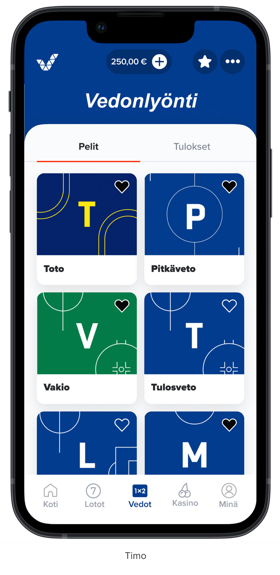
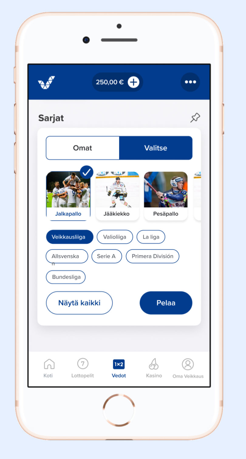
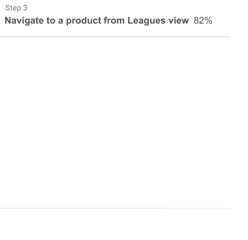
Personalized page navigation
An ideation workshop
What to show in the leagues view in its empty state, when landing there?
Two multidisciplinary teams designed improvements. Each team had a designer, a data scientist, and a betting product specialist.
Workshop outcome
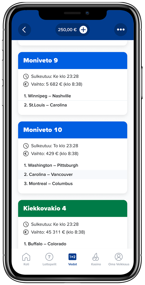
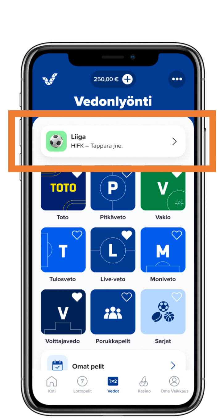
Two similar designs with personalized quick links and default leagues. Quick Links became a winning approach.
A new proto
After the workshop, we designed a personalized page navigation with quick links and a pre-selected league.

Findability & conversion
AB testing UI elements that influence findability and conversion is often worthwhile, since the first new version in production rarely turns out to be a winning design.
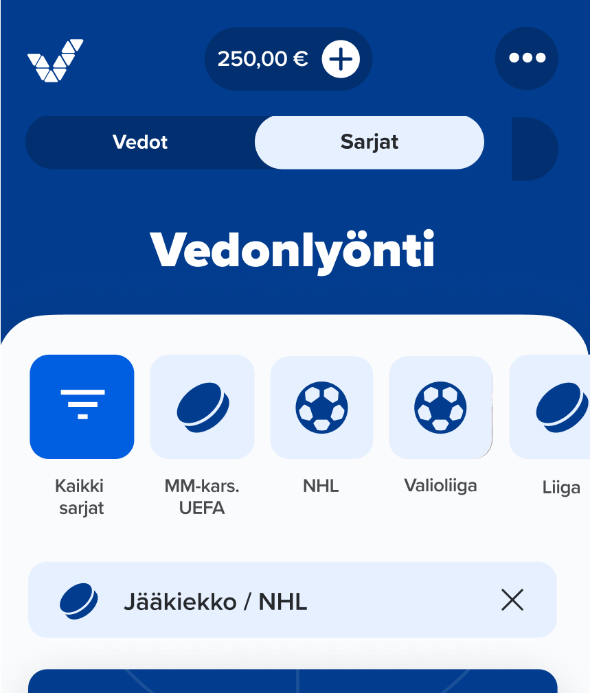
First AB test
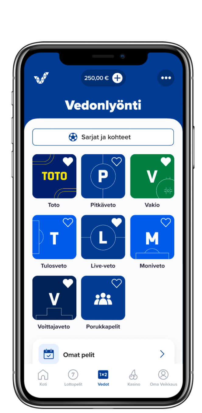
Findability: key to success
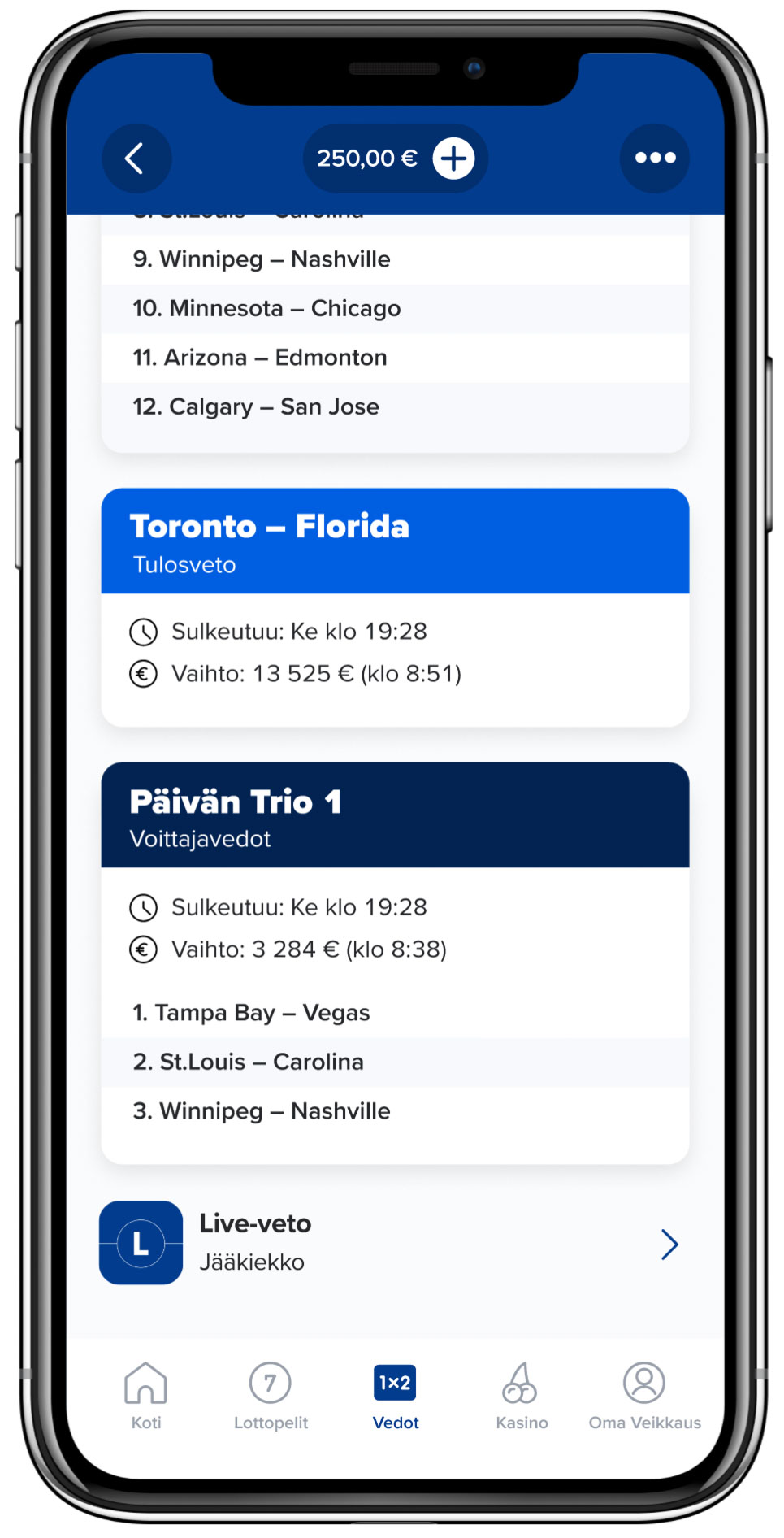
Many betting players tend to navigate straight to individual game products. Yet in tests, participants had found the Leagues view useful.
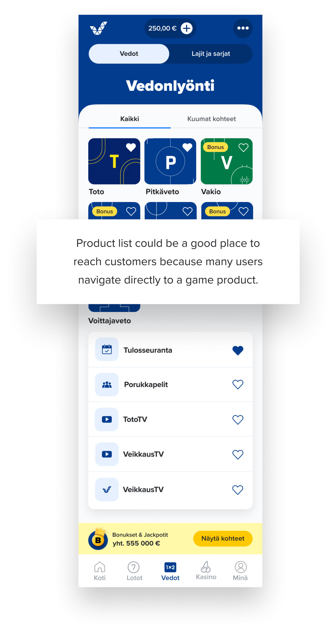
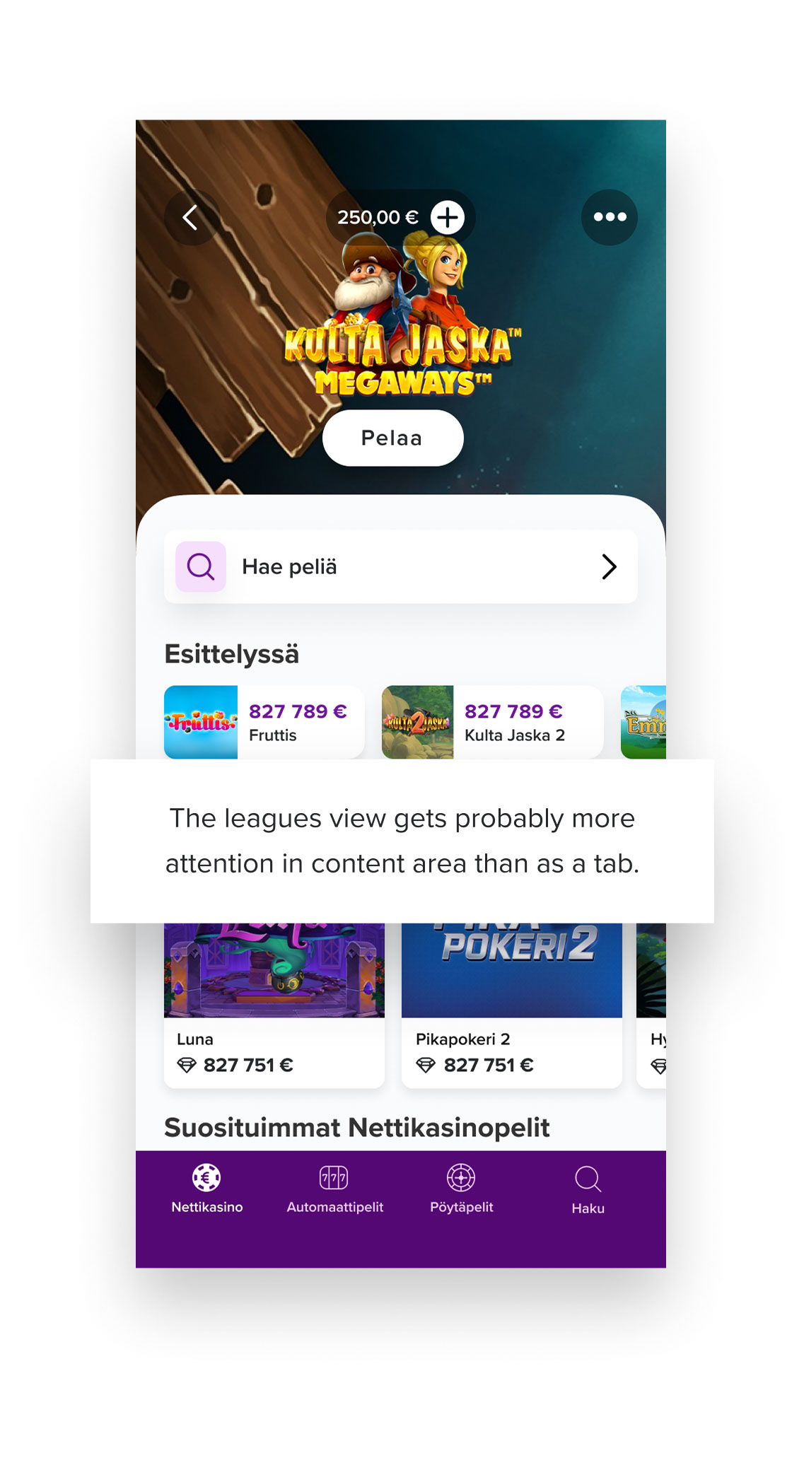
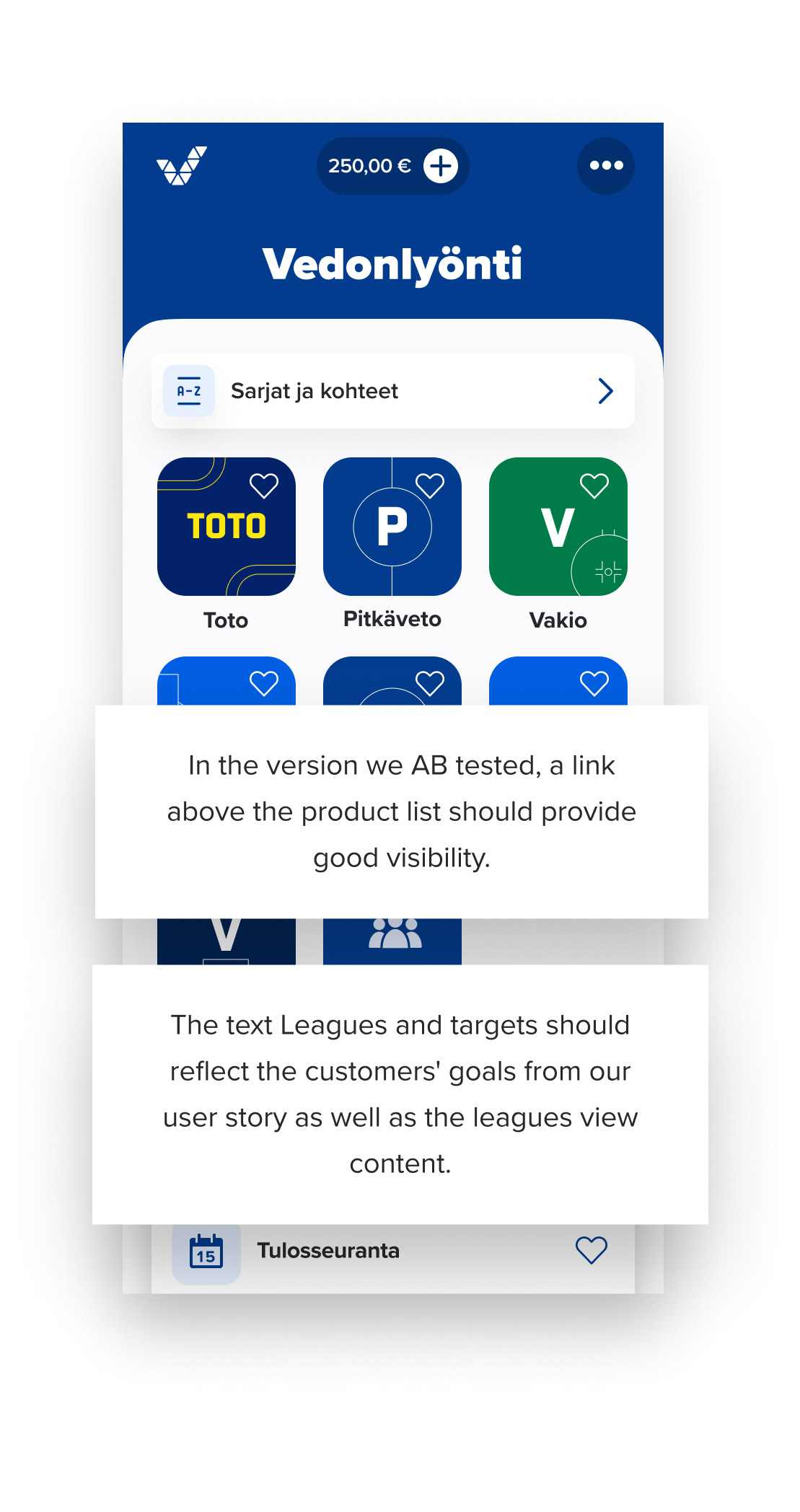
To make the Leagues view easy to find, we added a link right above the games (rightmost layout).
Behavioral insights
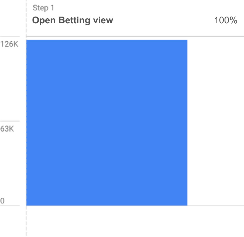
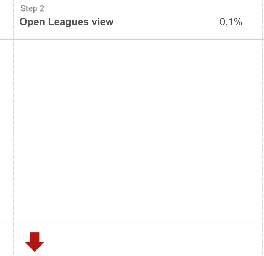
Only a handful of customers clicked the Leagues view link (see funnel above). Thus, we cut the AB test short based on the initial data I collected. However, once customers found the view, they usually navigated further to products (third step).
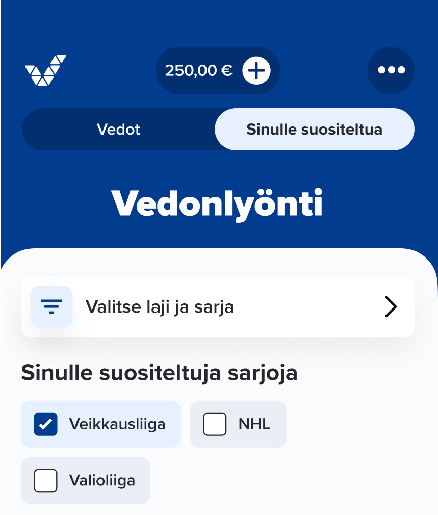
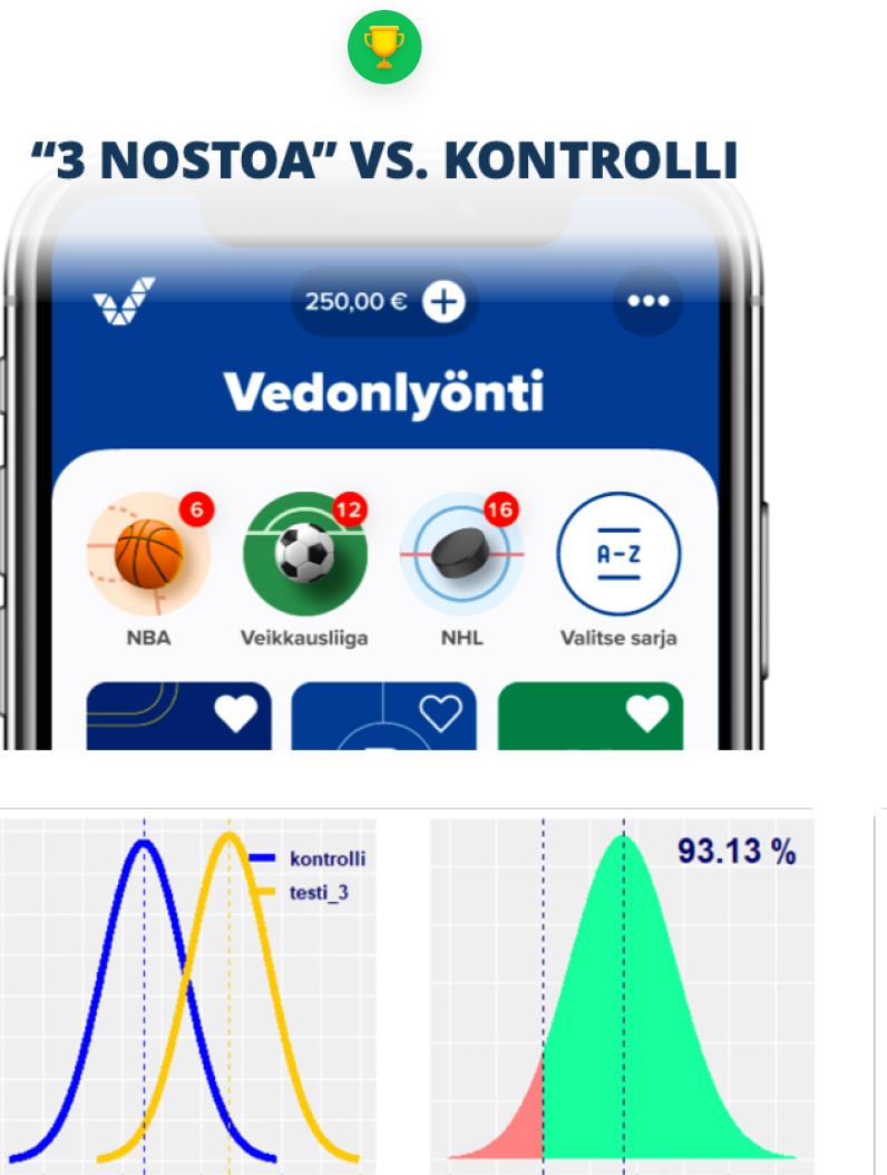
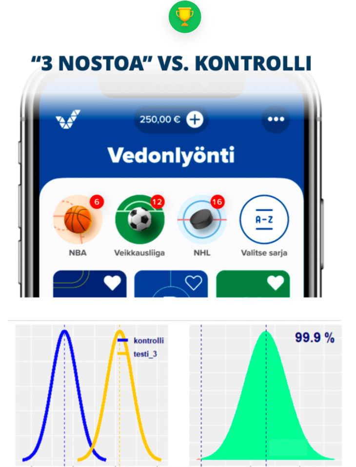
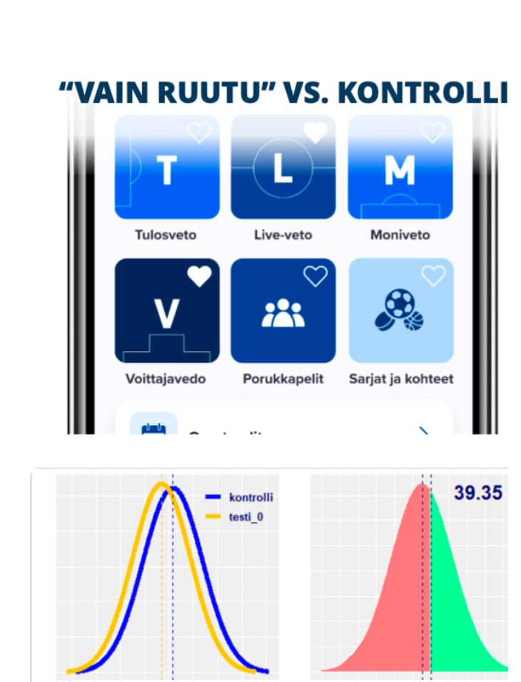
Second ABC test
Versions
Would direct links to leagues convert better than a static heading? I designed a new version that visualized our user story directly (center image). Meanwhile, Timo and Petteri used outputs from our earlier brainstorming for their version.
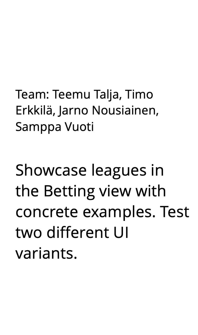
Our Data Scientist Jarno developed a new machine learning model to personalize leagues. Both UI versions are built around the ML model.
Extent of purchased products
In the ABC test, both new versions raised the average number of betting products per customer by 2%.
Sales conversion
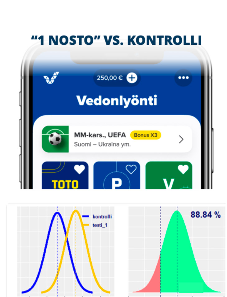
Both versions converted well, but the list version performed even better, with a 3% increase in app betting.
Final flow
The Leagues view became the app’s third most popular betting view! Impressively, all of its frontend was coded from scratch in just a few weeks.
Thanks for reading this case study!