I outlined a user-centered design process model in my earlier article, but did not put it in context. Despite novel, peer reviewed user- and human-centered design methods exist, the meanings of the terms are loose in everyday use. This article presents the ISO 13407 human-centered design process model and introduces a lighter model based on it, with a design practice point of view.
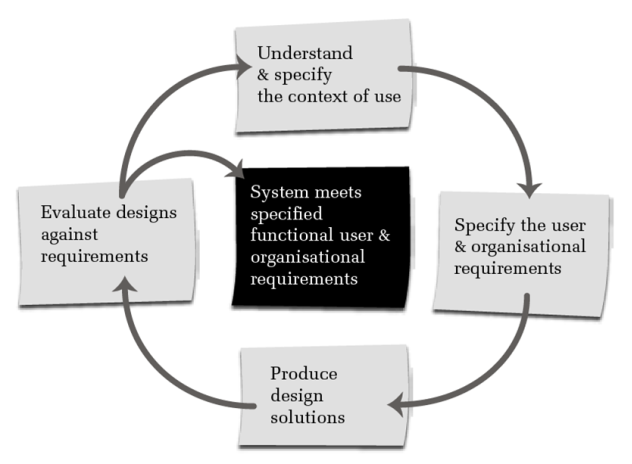
ISO 13407 is about the human-centered design of interactive systems. The standard introduces a process model (image below), which has four activities:
- Understanding the context of use
- Setting goals
- Designing solutions
- Evaluating the solutions

The ISO-13407 process model is cyclical by nature. In my experience, it reflects better the information flow than the stages of design work because several ISO activities may take place in one moment. For example, beneficial user experience evaluation often aims at gaining understanding not only of existing solution usability, but also of the situations where the solution is used and why, its context of use. Several ISO activities take place in one moment also at design, when insight on a usage situation and its needs arise, and an outline of a potential solution comes to life.
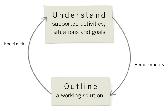
Human-centered design work can be reduced to two activities in my view. First you gain understanding of usage situations and goals, then visualize a solution that supports these (image below). The two elements may be called research and design, but speaking of research may sound overblowing in the following examples.
The project topics of typical service and interaction designer work are quite extensive, and one “round” of human-centered design takes a few weeks. The Finna.fi search service, whose usage situations I surveyed last year and whose usability I am responsible for, has been typical by extent. I did not accomplish an actual user study for the situations and goals survey because credible situations had been identified and collected earlier. An empirical study was not necessary neither because Finna.fi is a broad user base service, and many situations and goals were intuitively clear to me and others based on our earlier experiences, on “own life ethnography”.
I found three main categories, thematic, known-item and browse search, when I analyzed the situations of use. For example, collecting material on the Finnish musicologist A. O. Väisänen for a TV documentary or for research would be thematic search. Finding an exam book is known-item search. The goals of users are not always very concrete in browse search, for example when a researcher surfs information about certain pieces of art for inspiration and potential research topics. The situations and goals analysis took a few months. It was not full time work because we designed and a Scrum team implemented user interface improvements concurrently. Many interface improvement ideas arose when walking through the usage situations, and Scrum tasks were prioritized based on how often certain usability problems recurred. All example situations which had sufficient background information to evaluate user experience were documented. Fifteen to twenty examples were left out because they lacked some information necessary for walkthrough. I have walked through the example situations every few months in order not to forget the context of use, and to stay tuned with the current user experience and usability of Finna.fi when the service evolves.
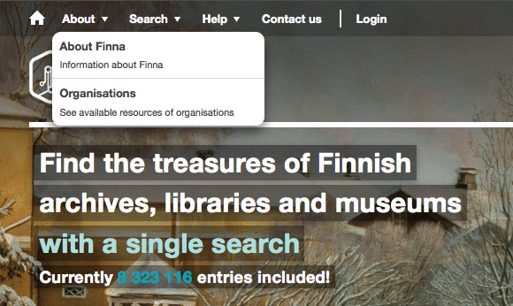
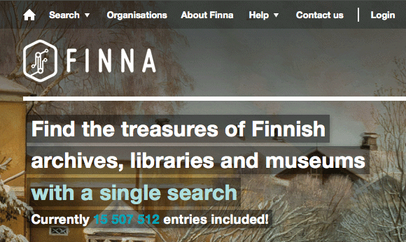
Also the design of smaller tasks sometimes proceeds in “rounds” of human-centered design. For example, when we introduced a list of participating organizations, the list was first difficult to find because it was under a first level menu link whose text did not draw to click. The upper left image shows the first version. The link was then moved to menu first level where it is immediately visible (lower image). The design and implementation of the improvement took altogether less than one man day.
The terms human- and user-centered design mean the same to me, but have slightly different emphases. Material called human-centered design typically considers designers’ own work processes and customer needs, whereas user-centered design tends to focus on product – end user interactions. The term user-centered design was first introduced in the Don Norman book The Design of Everyday Things, which is available online free of charge.
 Teemu Talja


Great article. very informative and post.
nice work, keep up the good work.
excellent