 Teemu Talja
 HSB (HSV) makes color adjustment easy. You can use HSB color model in most graphic design software.
HSB components are hue (H), saturation (S) and brightness (B). When you understand what they do, you get fast and effective at tuning colors.
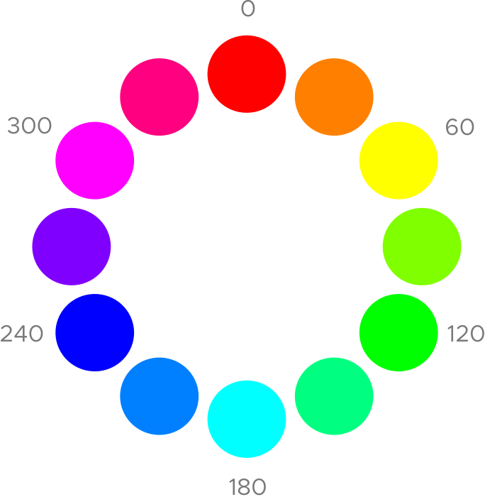
Hue
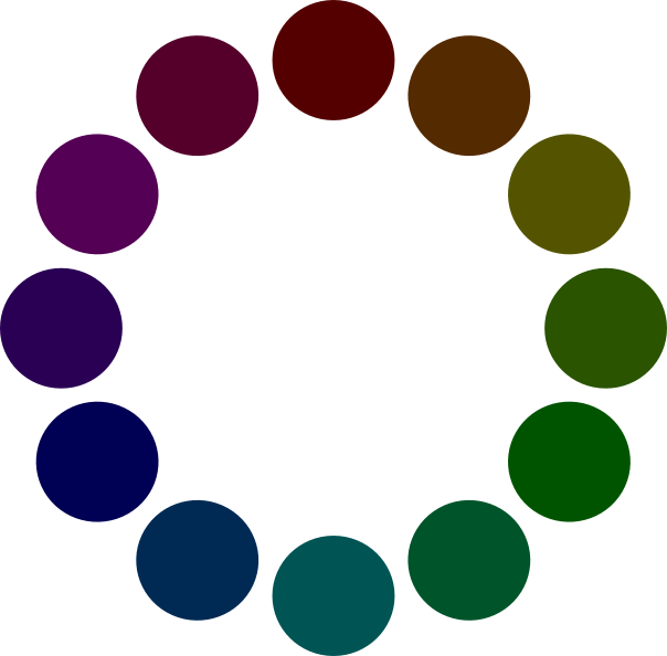
Hue is the “essence” of most color. It is expressed as degrees from 0° to 360°. Thus it is often visualized as a color circle.
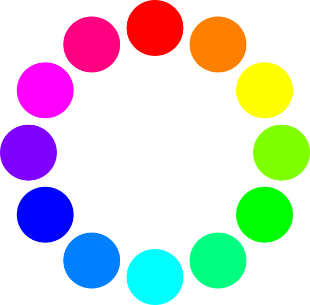
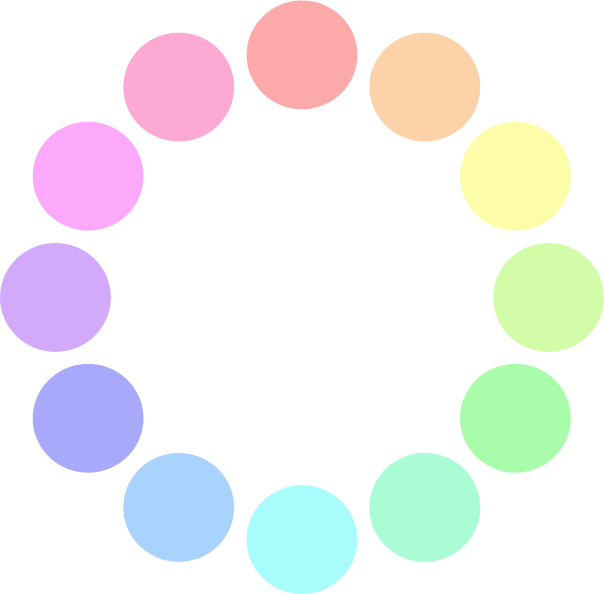
Saturation
A saturation value expresses how much white (or gray) a color has. 100% means full color, 0% white (or gray).


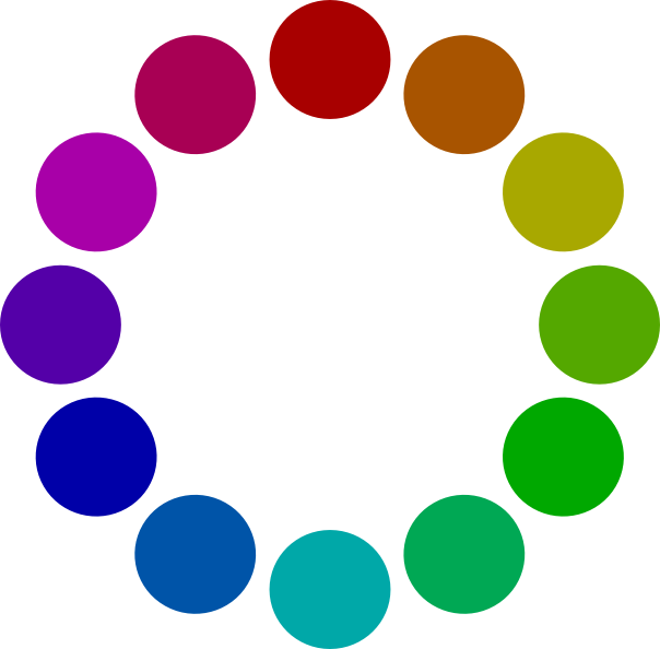
Brightness
A brightness value expresses how much black a color has. 100% means full color and 0% pure black.

Hue as a box of gradients
In its color pickers, Sketch app has a gradient box for adjusting saturation and brightness of a hue. Horizontal axis shows saturation, and vertical axis brightness of a color.

Luminosity
Some hues are luminous and others more dark. Luminosity differences become evident, when you make a color circle grayscale (image below).
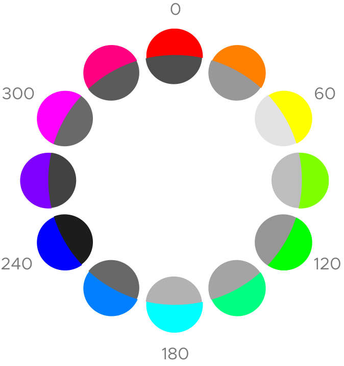
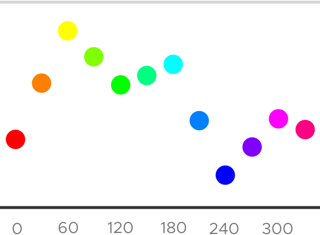
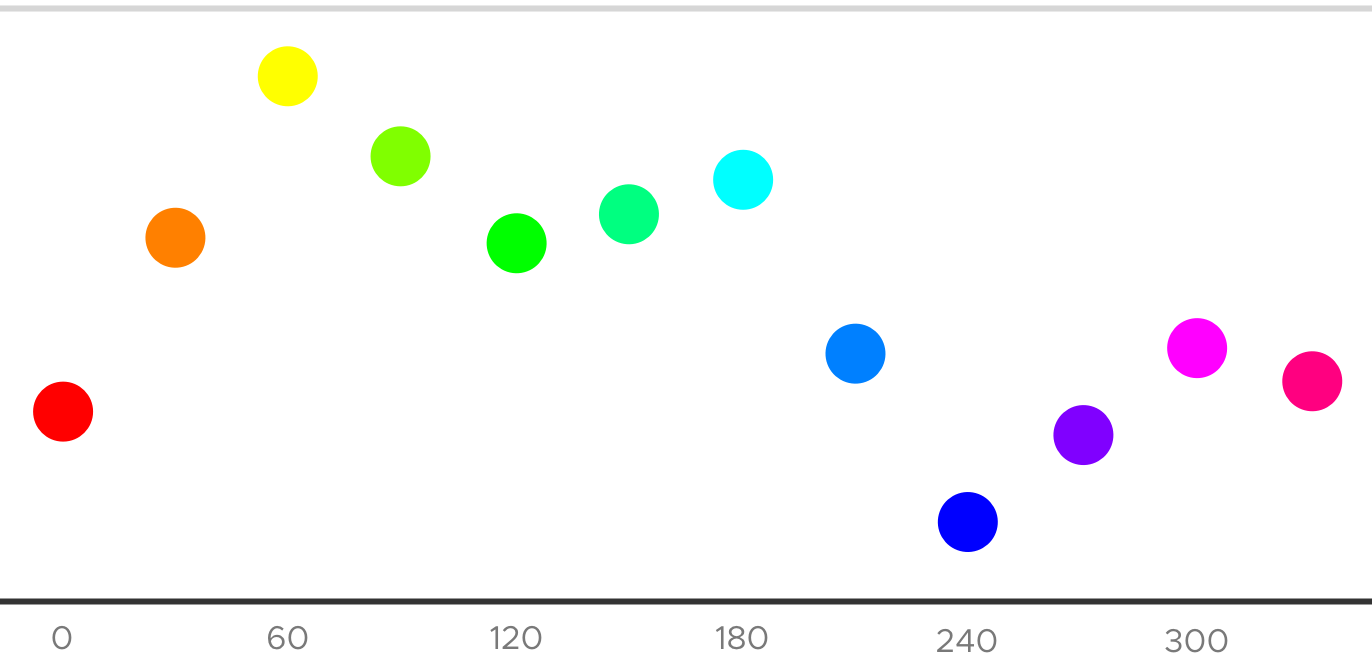
Pure red (0°), green (120°) and blue (240°) hues are dark by nature. On the other hand, yellow (60°), cyan (180°) and magenta (300°) have high luminosities. Below diagram visualizes luminosities on vertical axis.
Few hues, many values
Visual identities often have a main hue. Even a single hue gives diverse options, when you vary brightness and saturation.
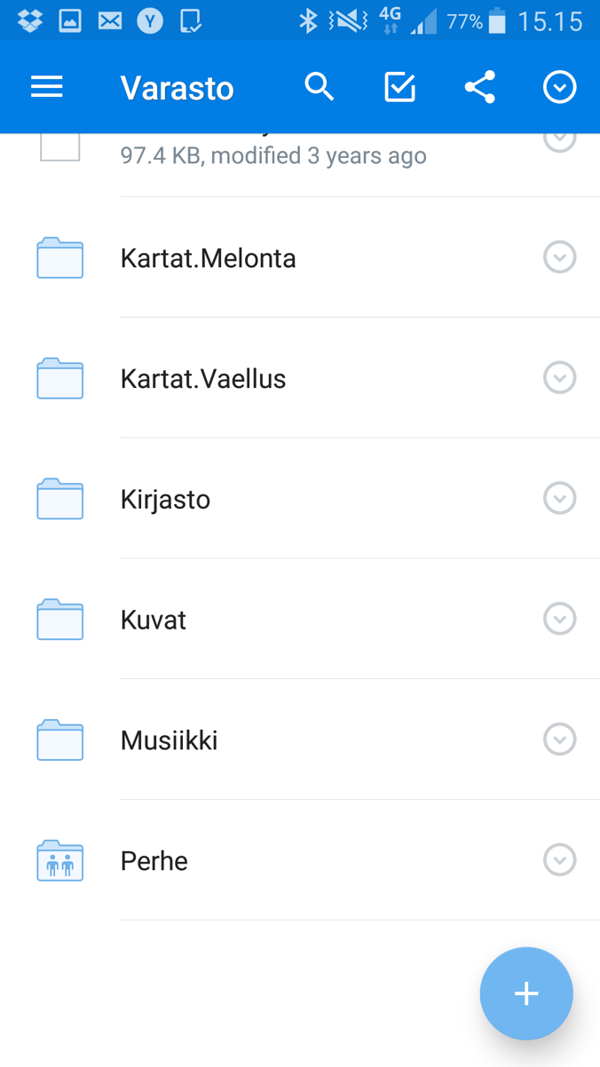
Dropbox Android app has a single hue visual style. The hue of its blue is ~210°.
Status bar and toolbar have saturations close to 100%. Yet floating action button fill has only ~50% saturation, and folder icon just 4% saturation. Thus the latter two fill colors look like they contain some white.
Darkening by hue shift
In a current project, I designed a facet modal. Visual identity was single hue. Its only brand color was ~180° cyan, which is a high luminosity hue.
50% and 10% saturated, dark cyans look unpolished as background colors of this facet. See images below.
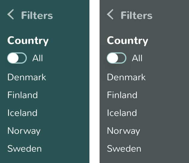
50% saturated version (left column) reminds me of early 1900’s art nouveau. That is too far from the Apple iOS like original style. In a way I like this one, though.
A 10% saturated background looks mostly gray. That is not horrible either. Yet I wanted a more branded style here.
I then shifted the original, cyan accent color towards blue by 15—20°. A slightly purer blue (~200°) maintains the feel of the brand color. Yet its dark variants look quite neutral. See image below.
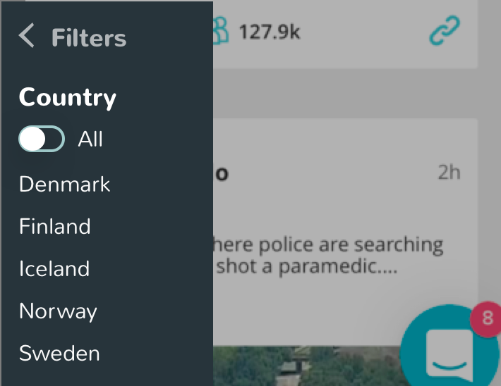
The new dark UI has same accent color as the original layout. Its toggle buttons and arrowheads have the cyan hue. Same accent color integrates the dark and light parts to one UI.
In the beginning, I had only a vibrant accent color. Then understanding HSB color model helped me to create a discreet and coherent dark background color out of it.
A learning game for HSB color model
You get effective at adjusting colors, when you remember by heart, what hue values colors have. A sense of hue luminosities makes selecting colors even easier. Erik D. Kennedy’s Color guessing game for HSB color model lets you train these and more color skills.
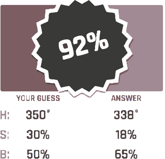
Following points help you to learn HSB color model faster, and score better in the color game.
- If a color looks like it has some white (“tinted”), it might have low to mid range saturation (0% to 75% S).
- If a color looks partly black (“shaded”), its saturation might be low (0% to 33% B).
Similar looking colors can have very different saturation and brightness values. For example, reds can look somewhat saturated and dark also, when saturation is low and brightness high (image above). Thus it is useful to have a sense, how saturation and brightness affect distinct hues.